
10 Essential Website Design Tips to Boost Your Business
10 Essential Website Design Tips to Boost Your Business

Your website might look sharp, but if it's not turning visitors into customers, it's not doing its job. Many small and medium-sized businesses pour time and money into a site that sits there looking polished while leads slip through the cracks. The truth is, great design isn't just about aesthetics. It's about strategy. The most effective websites are built around clear goals, real user behavior, and consistent brand messaging. In this article, we're sharing practical website design tips that go beyond the surface level, so your site can work as hard as you do.
Table of Contents
- Understand your audience and set clear website goals?
- Prioritize clean layout, branding, and intuitive navigation?
- Craft engaging content and compelling calls to action?
- Use visuals, color, and mobile optimization strategically?
- Maintain, update, and analyze your site for ongoing improvement?
- Why most website design advice misses what really matters?
- Level up your site with expert design support?
- Frequently asked questions?
Key Takeaways
| Point | Details |
|---|---|
| Know your visitors | Design your site around your ideal customer's needs and expectations. |
| Simple is better | A clean layout and easy navigation drive trust and ease customer journeys. |
| Mobile matters | Responsive, mobile-friendly sites deliver more engagement and conversions. |
| Test and improve | Continuously review analytics and user feedback to keep your site effective. |
Understand your audience and set clear website goals
Every strong website starts with a simple question: who are you building this for? Before you choose a color palette or write a single line of copy, you need a clear picture of your ideal customer. Think about their age range, what problems they're trying to solve, and how they typically search for solutions online. When you know who you're talking to, everything else becomes easier.
Once you understand your audience, define what you want your site to actually do. Are you trying to generate leads? Sell products directly? Build brand awareness in a local market? Each goal requires a different approach to layout, content, and calls-to-action. A site built to collect quote requests looks very different from one designed to drive e-commerce sales.
Here's how to align your website with both your audience and your goals:
- Identify your top 2-3 customer profiles (job title, age, main pain point, how they find you)
- Choose one primary website goal and let it guide your homepage layout
- Map your content to the questions your audience asks at each stage of their decision
- Set up analytics (like Google Analytics) from day one so you can track what's working
- Schedule a quarterly review to check if your site still reflects your current offer and audience
Sites that are designed with their audience in mind perform better in conversions. This isn't a surprise. When visitors feel like your site was built for them, they stay longer and take action.
Visit your own website as if you're a first-time customer. Does the homepage answer their top questions? Is the path to contact or purchase obvious? If you hesitate, your visitors will too. Reviewing website design best practices can help you audit your site with fresh eyes.
Pro Tip: Call or email three to five existing customers and ask them one question: "What was confusing or helpful when you first visited our site?" Their answers will tell you more than any tool.
With a roadmap in place, the next step is to focus on what visitors see first.
Prioritize clean layout, branding, and intuitive navigation
First impressions happen in milliseconds. When a visitor lands on your page, their brain makes a snap judgment about whether to trust you, and that judgment is largely visual. A cluttered, inconsistent, or confusing layout sends people away before they've read a word.
Clean design isn't about being minimal for the sake of it. It's about guiding attention. Whitespace (the empty space around elements) gives your content room to breathe and helps the eye move naturally toward your most important messages and buttons. Resist the urge to fill every corner of the page.
Here are the core elements of a trustworthy, easy-to-use layout:
- ✅ Simple, predictable menus placed in familiar locations (top of page, left sidebar)
- ✅ Consistent branding : same colors, logo usage, and fonts across every page
- ✅ Visual hierarchy : larger, bolder elements draw attention first
- ✅ Clear sections with enough whitespace to separate ideas
- ❌ Avoid autoplay videos, pop-ups, or animations that distract rather than support
Consistent branding and clear navigation boost user trust. Visitors who feel confused or overwhelmed don't convert. They bounce.
Here's a quick comparison that illustrates the real difference:
| Feature | Clean homepage | Cluttered homepage |
|---|---|---|
| Average bounce rate | 35-45% | 60-80% |
| Time on page | 2-4 minutes | Under 60 seconds |
| Conversion rate | 3-6% | Under 1% |
| User trust score | High | Low |
These numbers reflect general industry patterns and show just how much layout decisions affect business outcomes. For inspiration, look at real-world branding examples to see how strong visual identity translates to site confidence.
If you're building or refreshing your brand alongside your site, reading up on integrating branding into web design and business branding tips gives you a practical foundation.
Pro Tip: Limit your main navigation menu to five to seven items. More than that and visitors feel overwhelmed. When everything is a priority, nothing is.
Now that you know how to welcome users visually, it's crucial to keep them engaged with quality content.
Craft engaging content and compelling calls to action
Great design draws people in, but content is what convinces them to stay and act. Too many business websites fill their pages with vague language like "We provide solutions" or "Committed to excellence." These phrases say nothing. Your visitors want specific answers, fast.
Write for humans first. Avoid corporate-speak and get to the point within the first two sentences of any page. Lead with the benefit to the reader, not the feature of your service. Instead of "We offer web design services," try "We build websites that bring in more customers."
Every important page on your site should include a clear call-to-action (CTA). A CTA is a prompt that tells the visitor what to do next. Here are three must-have CTAs for any small business homepage:
- Primary CTA : "Request a Free Quote" or "Book a Call" (placed above the fold, meaning visible without scrolling)
- Secondary CTA : "See Our Work" or "Learn More" (for visitors who aren't ready to commit yet)
- Trust CTA : "Read Our Reviews" or "See Case Studies" (builds confidence before a decision)
"Your content should answer your audience's top questions quickly." This is expert consensus across conversion optimization and UX (user experience) research, and it holds true for businesses in every industry.
Clear, well-structured content improves both user experience and search rankings. Search engines reward pages that answer questions directly and keep readers engaged. If you want to understand how search visibility connects to your content, SEO explained is a helpful starting point. And for a deeper dive into content strategy, SEO content best practices walks you through the process step by step.
After the message is in place, design elements should reinforce credibility and engagement.
Use visuals, color, and mobile optimization strategically
Images, color choices, and mobile performance are not afterthoughts. They are central to whether your website builds trust or erodes it. A blurry hero image (the large banner at the top of your homepage) or a color palette that clashes tells visitors your business isn't paying attention to detail.
Here are best practices for visuals and accessibility:
- Hero images : Use high-resolution photos that reflect your actual business or customers. Avoid overly generic stock photos.
- Logo placement : Always position your logo in the top-left corner. It's where eyes go first.
- Alt text : Add descriptive alt text (a short written description) to every image. This supports ADA accessibility and helps search engines index your content.
- File size : Compress images before uploading. Large files slow your site down, which drives visitors away.
Color is more strategic than most people realize. A consistent, well-chosen palette increases brand recall by up to 80%, meaning people remember you more easily. Choose two to three primary colors that reflect your brand personality and stick with them.
Now, here's a number that should get your attention: mobile-optimized sites see up to 5x more engagement. Most of your potential customers are landing on your site from a phone. If your site isn't built to perform on mobile, you're losing them immediately.
| Metric | Desktop | Mobile |
|---|---|---|
| Share of web traffic | ~45% | ~55% |
| Average session duration | 4.5 minutes | 2.8 minutes |
| Conversion rate | 3.9% | 1.8-3.5% (optimized) |
| Bounce rate if slow | 30% | 53%+ |
Strong visuals for digital marketing tie your website into a wider strategy that keeps your brand recognizable across every touchpoint.
With the visual and technical aspects covered, let's make sure your new site continues to deliver value as it grows.
Maintain, update, and analyze your site for ongoing improvement
A website is not a billboard. You don't build it, hang it up, and walk away. Businesses that treat their site as a living tool rather than a finished product consistently outperform those that don't. The good news is that maintaining a high-performing site doesn't require a full redesign every year.
Here's a practical maintenance checklist to build into your schedule:
- Monthly : Review your top landing pages in Google Analytics. Check for broken links and test your contact forms.
- Quarterly : Update service descriptions, refresh any outdated blog posts, and test all CTAs to confirm they work.
- Annually : Audit your site's overall messaging to ensure it reflects your current positioning and target audience.
- After major changes : Whenever you launch a new service, change your pricing, or rebrand, update your site immediately.
Regular website updates improve conversions and keep your business competitive. Stale content sends a signal to both visitors and search engines that your business isn't active.
Analytics data will show you exactly where visitors drop off, which pages get no traffic, and which CTAs people actually click. This removes the guesswork and lets you make decisions based on real behavior. Pairing regular updates with solid website maintenance and SEO practices compounds your results over time.
Pro Tip: Set a recurring calendar reminder every three months to run through your site's key pages, test every form, and check that your contact information is accurate. It takes less than an hour and can save you lost leads.
Now that you know how to build and maintain a website that works, let's look at what most advice gets wrong.
Why most website design advice misses what really matters
Here's something we've seen repeatedly with clients: businesses spend months chasing the "perfect" design trend only to find their results don't change. Parallax scrolling, dark mode, micro-animations. These features come and go. What doesn't change is whether your website clearly answers your customer's questions and makes it easy for them to take the next step.
The real competitive edge isn't a flashier site. It's a smarter one. Businesses that invest in continuous, data-driven improvement and listen to their actual users outperform those who redesign every few years based on what looks cool at the time.
Treat your website as your best salesperson. It should be earning its keep every single day. Before jumping into any redesign, take a brand readiness assessment to make sure you're solving the right problem first. The most dangerous mistake is spending resources on aesthetics when your real issue is messaging or structure.
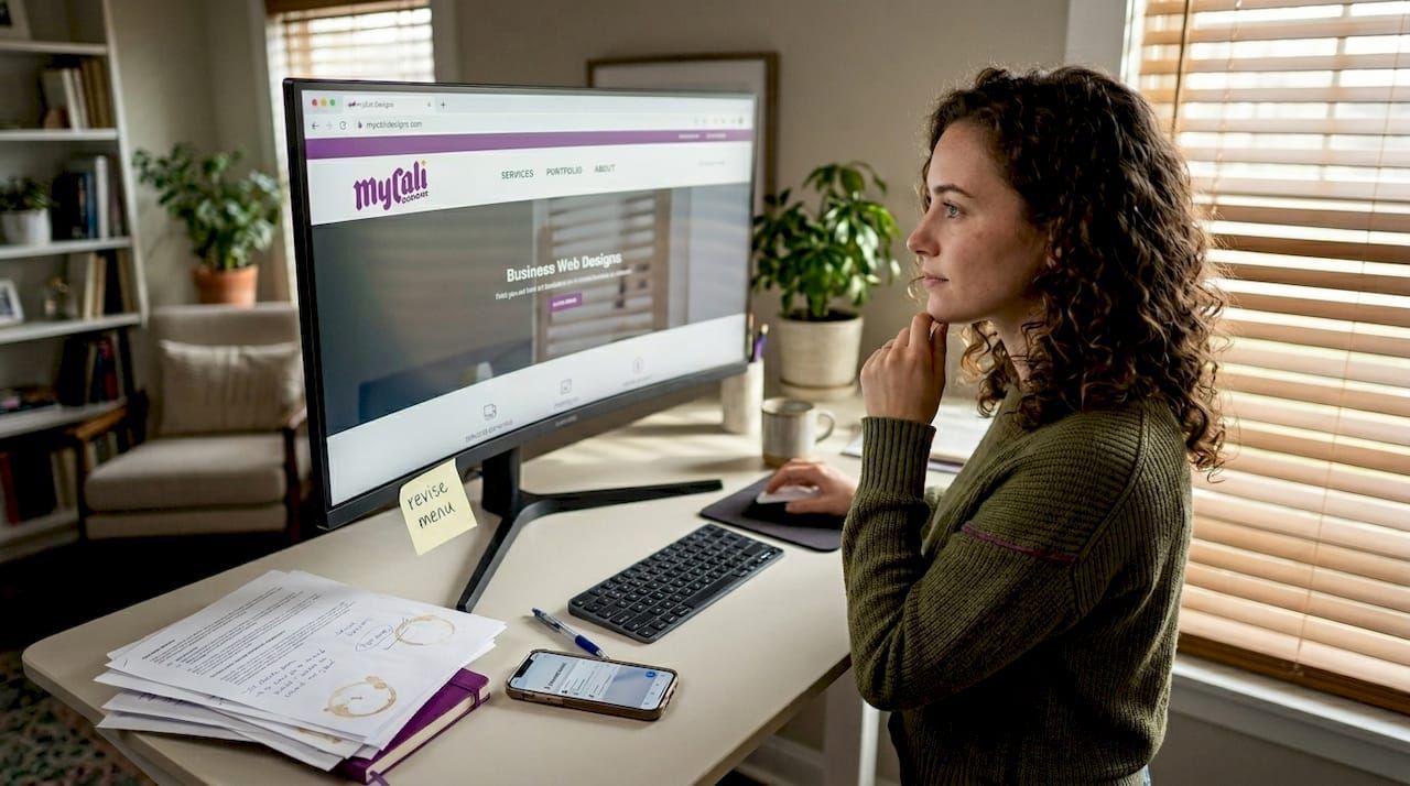
Level up your site with expert design support
Implementing these website design tips on your own is absolutely possible, but some upgrades require a deeper level of expertise. Advanced functionality, custom layouts, and cohesive branding systems are areas where professional guidance pays for itself quickly.
At Mycali Designs, we help small and medium-sized businesses build websites and brands that actually support growth. Whether you need professional branding help to sharpen your visual identity or custom website upgrades to take your site to the next level, our team is ready to work with you. Reach out for a free consultation and let's talk about where your site is today and where it could be.
Frequently asked questions
How often should I update my business website's design?
A full redesign every 2-3 years is standard practice, but updating your content, visuals, and CTAs on a quarterly basis will keep your site competitive and converting. Regular updates are what separate high-performing sites from stagnant ones.
What is the most important element for website success?
Clear navigation and strong calls-to-action are the foundation. Consistent branding and a logical page structure ensure visitors know where they are and what to do next, which is what drives results.
Do I need a professional designer for a small business website?
Basic website builders can work for very limited needs, but professional designers ensure your site looks credible, functions smoothly, and is built around your business goals. Sites designed with their audience in mind convert far better than templates applied without strategy.
How does mobile design impact my business site?
Mobile-optimized websites attract more traffic, increase engagement, and significantly reduce bounce rates. With up to 5x more engagement on mobile-optimized sites, ignoring mobile performance is one of the costliest mistakes a business can make.
Recommended
Recent Posts