


Why Responsive Design for Restaurant Websites Matters
Why Responsive Design for Restaurant Websites Matters

TL;DR:
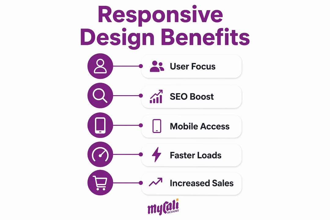
- Responsive web design ensures restaurant websites automatically adapt to all screen sizes, improving user experience and SEO. It enhances local search rankings, increases direct bookings, and reduces reliance on costly third-party platforms. Regular testing on real devices maintains layout consistency, ultimately driving more customers and revenue.
Responsive web design for restaurant websites is defined as a development approach where your site automatically adjusts its layout, images, and content to fit any screen size, from a desktop monitor to a smartphone. Mobile traffic accounts for over 60% of global web visits, which means most people searching for your restaurant right now are doing it on a phone. If your site forces them to pinch, zoom, or scroll sideways to find your menu, they leave. A responsive site removes that friction entirely, and that difference directly affects whether a customer walks through your door or calls your competitor.
Why responsive design for restaurant websites is non-negotiable
Responsive web design, the industry-standard term coined by Ethan Marcotte in 2010, uses CSS media queries, flexible grids, and fluid images to serve one codebase across all devices. For restaurant owners, this is not a technical nicety. It is the foundation of your online presence.
Think about what a customer needs from your website in under 60 seconds: your hours, your menu, a way to reserve a table, and a phone number. On a non-responsive site, those elements often break, overlap, or disappear entirely on mobile. On a properly built responsive site, every one of those elements is immediately accessible, readable, and tappable without any extra effort from the visitor.
Google now uses mobile-first indexing, meaning the mobile version of your site is what Google evaluates when deciding where you rank in search results. If your mobile experience is broken or degraded, your ranking suffers regardless of how polished your desktop site looks. For a local restaurant competing for "best tacos near me" or "Italian dinner downtown," that ranking difference is the difference between a full dining room and empty tables.
The importance of responsive design goes beyond aesthetics. It is a direct signal to Google, and to your customers, that your business is professional, current, and worth their time.
How responsive design improves user experience and customer engagement
A mobile-friendly restaurant site does one thing above all else: it removes obstacles between a hungry customer and a completed action, whether that action is viewing your menu, booking a table, or placing an order.

Responsive designs optimize images and layouts to prevent slowdowns and visitor drop-off. A large, uncompressed hero image that looks stunning on desktop can take 8 to 10 seconds to load on a mobile connection. Most visitors abandon a page after 3 seconds. Responsive design addresses this by serving appropriately sized images and simplified layouts to smaller screens, keeping load times fast and visitors engaged.
Here is what a well-built, mobile-optimized restaurant site delivers that a broken or desktop-only site cannot:
- Readable menus without zooming. Text scales correctly so customers can browse your full menu without pinching the screen.
- One-tap reservations. Booking forms designed for mobile have large input fields and minimal steps, reducing abandonment.
- Clickable phone numbers. A responsive site formats your contact number as a tap-to-call link automatically.
- Accessible online ordering. Cart flows and checkout pages adapt to small screens so customers complete purchases instead of abandoning them.
- Consistent branding. Your logo, colors, and photography display correctly across every device, building trust with first-time visitors.
Poor mobile experience in a restaurant context looks like this: a customer searches for your restaurant on Saturday night, lands on your site, and cannot read the menu because the text is 6 pixels tall. They close the tab and open a competitor's site instead. That is a lost cover, and it happens hundreds of times a week for restaurants with unresponsive sites.
Pro Tip: Test your restaurant website on three devices right now: an iPhone, an Android phone, and a tablet. Check whether your menu loads clearly, your reservation button is tappable, and your address links to Google Maps. If any of those fail, you have a conversion problem, not just a design problem.
You can learn more about designing for customer attraction in Mycalidesigns' dedicated guide on restaurant website strategy.
Why responsive design matters for SEO and restaurant visibility
Search engine optimization for restaurants is largely a local game. You are competing for customers within a few miles of your location, and Google's local search algorithm weighs mobile usability heavily.
Google rewards sites that deliver smooth navigation, readability, and fast response times through its ranking signals. This is not a soft preference. Google's Core Web Vitals, specifically Largest Contentful Paint (LCP), Cumulative Layout Shift (CLS), and Interaction to Next Paint (INP), are direct ranking factors. Poorly sized images and layout shifts cause Core Web Vital failures on mobile, and those failures translate into lower rankings.
Here is how responsive design connects to each Core Web Vital:
| Core Web Vital | What it measures | How responsive design helps |
|---|---|---|
| LCP (Largest Contentful Paint) | How fast the main content loads | Optimized, scaled images load faster on mobile |
| CLS (Cumulative Layout Shift) | How much the page jumps while loading | Fluid grids prevent elements from shifting unexpectedly |
| INP (Interaction to Next Paint) | How quickly the page responds to taps | Lightweight, mobile-first code reduces input delay |
Restaurants with mobile-optimized websites receive higher local search visibility and more direct bookings. This is the compounding effect of responsive design: better Core Web Vitals scores lead to higher rankings, higher rankings bring more traffic, and more traffic on a well-designed mobile site converts into actual reservations and orders.
"The best restaurant websites focus on certainty and speed: they combine fast, mobile-optimized layouts with clear calls to action and easily accessible menus." — RocketPages
A separate mobile site (the old "m.dot" approach) splits your SEO authority across two URLs, which dilutes your ranking power. Responsive design avoids SEO dilution by maintaining a single URL and codebase, concentrating all your backlinks and authority in one place. For a local restaurant, that consolidation matters enormously.
For a deeper look at how SEO connects to your restaurant's online visibility, Mycalidesigns' SEO services page covers the fundamentals clearly.
Responsive design techniques and best practices for restaurant sites
Understanding the technical side of responsive design helps you ask the right questions when working with a web designer or evaluating your current site.
The foundation of responsive web design rests on three elements: CSS media queries (rules that apply different styles at different screen widths), flexible grids (layouts that use percentages instead of fixed pixel widths), and fluid images (images that scale within their containers rather than overflowing them). These three tools have been the standard since Marcotte's original framework, and they remain the core of every well-built responsive site today.
Modern responsive design now incorporates container queries, fluid typography with clamp(), and CSS Grid for adaptive layouts. Container queries are particularly useful for restaurant sites because they allow individual components, like a menu card or a reservation widget, to respond to the size of their own container rather than just the screen width. This means your menu section can reflow correctly whether it appears in a sidebar, a full-width column, or a modal window.
Pro Tip: Ask your web designer whether they build mobile-first. A mobile-first approach means the base CSS is written for small screens and scaled up for larger ones, which produces leaner, faster code than the reverse. For a restaurant site where most visitors arrive on phones, mobile-first is the correct starting point every time.
Treating responsiveness at the component level ensures consistent behavior and reduces layout bugs across your entire site. This is especially relevant for restaurant websites that use reusable components like menu item cards, photo galleries, and booking forms. When each component is independently responsive, adding a new menu section or a seasonal promotion does not break your layout on any device.
The comparison between responsive design and adaptive design is worth understanding. Adaptive design uses fixed layouts for specific screen sizes (typically six breakpoints), while responsive design flows fluidly between any size. For most restaurants, responsive design is the better choice because it requires one codebase, one maintenance path, and delivers consistent SEO benefit across all devices.
Business benefits: how responsive design drives more customers and revenue
Responsive design is not just a technical investment. It is a direct driver of revenue for your restaurant.
The clearest financial case comes from direct ordering. Restaurants can save 15 to 35% in commission fees by owning customer data through custom, responsive websites instead of relying on third-party delivery platforms. That is a significant margin recovery for any restaurant operating on tight food costs. When a customer orders directly through your responsive website, you keep the full transaction value and you own the customer relationship.
The business benefits of a mobile-friendly restaurant site extend across several areas:
- More direct reservations. A responsive booking form that works flawlessly on mobile captures table reservations that a clunky form loses. Fewer steps and faster load times mean higher completion rates.
- Reduced third-party dependency. Every order placed through your own site instead of a delivery aggregator saves you commission fees and gives you the customer's contact information for future marketing.
- Customer data ownership. When customers order or book through your site, you collect their email addresses and order history. That data powers loyalty programs, targeted promotions, and repeat visit campaigns.
- Stronger brand perception. A polished, fast, mobile-optimized site signals professionalism. Customers associate the quality of your website with the quality of your food and service before they ever visit.
- Higher conversion from local search. When your site ranks well and loads fast, the customer who finds you on Google is far more likely to complete a booking or order than one who lands on a slow, broken page.
Responsive design is also a long-term cost saver. Maintaining one responsive site costs significantly less than managing a separate desktop site and a separate mobile site. Updates happen once and apply everywhere.
Key takeaways
A responsive restaurant website is the single most impactful technical investment you can make to attract more customers, rank higher on Google, and increase direct revenue.
| Point | Details |
|---|---|
| Mobile-first indexing | Google ranks your site based on its mobile version, making responsive design a direct SEO requirement. |
| Core Web Vitals | Responsive design improves LCP, CLS, and INP scores, which are direct Google ranking factors. |
| Direct revenue impact | Owning your ordering channel through a responsive site can save 15 to 35% in third-party commission fees. |
| Single codebase advantage | One responsive site concentrates SEO authority and reduces ongoing maintenance costs versus separate mobile sites. |
| Component-level responsiveness | Building each element to respond independently prevents layout bugs and keeps your site consistent across all devices. |
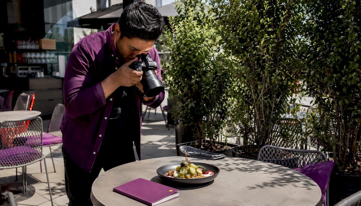
What I've learned from building restaurant websites that actually convert
I have worked on enough restaurant websites to recognize a pattern: most owners know their site needs to look good, but very few understand that how it performs on a phone is what actually determines whether a customer books a table or bounces.
The most common mistake I see is treating mobile as an afterthought. A restaurant owner invests in beautiful photography and a well-written menu, then launches a site that was designed for desktop and "adapted" for mobile by shrinking everything down. The result is a site that technically loads on a phone but delivers a frustrating experience. Customers do not complain. They just leave.
The second mistake is assuming that a responsive site is a one-time fix. Devices change, browsers update, and new screen sizes appear constantly. A site that tested perfectly on mobile two years ago may have layout issues today because of a browser update or a new phone resolution. Regular testing across real devices, not just browser simulators, is the only way to catch these problems before they cost you customers.
My honest recommendation: start with your mobile experience and build upward. Ask yourself what a customer needs from your site in 30 seconds on a phone, and make those three or four things impossible to miss. Everything else is secondary. The restaurants that get this right see measurable improvements in direct bookings and online orders within weeks of launching a properly built responsive site.
— Cesar
How Mycalidesigns can build your restaurant's responsive website
At Mycalidesigns, we build restaurant websites that are designed to perform on every device from day one. Our process starts with mobile, because that is where your customers are, and scales up to deliver a consistent, professional experience on every screen.
We handle mobile optimization, SEO setup, and brand development as part of every website project, so you are not piecing together separate services from separate vendors. If your current site is losing customers because it does not work on phones, or if you are starting from scratch, our website and SEO services are built specifically to solve that problem. We also connect your responsive website to your broader digital marketing strategy so your investment works harder across every channel. Reach out to Mycalidesigns and let's build something that fills tables.
FAQ
What is responsive design for a restaurant website?
Responsive web design is a development approach where a single website automatically adjusts its layout and content to fit any screen size. For restaurants, this means menus, booking forms, and contact information display correctly on phones, tablets, and desktops without any extra effort from the visitor.
How does responsive design affect my restaurant's Google ranking?
Google uses mobile-first indexing, meaning it evaluates your mobile site to determine your search ranking. A responsive site that passes Core Web Vitals checks ranks higher than a slow or broken mobile experience.
Can a responsive website help my restaurant get more direct orders?
Yes. A mobile-friendly ordering flow reduces the friction that causes customers to abandon their cart, and owning that ordering channel means you avoid the 15 to 35% commission fees charged by third-party delivery platforms.
What is the difference between responsive and adaptive design?
Responsive design uses fluid layouts that adjust to any screen width using a single codebase. Adaptive design uses fixed layouts for specific screen sizes and often requires separate maintenance paths. For most restaurants, responsive design is the better choice because it is easier to maintain and delivers stronger SEO results.
How often should I test my restaurant website on mobile?
Test your site on real devices at least once per quarter and after any major update. Browser changes and new device screen sizes can introduce layout issues that only appear on specific phones, and catching them early prevents customer drop-off.
Recommended
Recent Posts