
Why menu design matters: boost sales and engagement fast
Why menu design matters: boost sales and engagement fast
Something as small as removing a dollar sign from your menu can increase what guests spend by about 8%, according to Cornell studies. Most restaurant owners pour energy into social media ads, loyalty programs, and seasonal promotions, yet the one tool sitting on every table gets almost no strategic attention. Your menu is not just a list of dishes and prices. It is an active sales instrument that shapes what guests order, how much they spend, and how they feel about the experience. This article walks you through the psychology, the data frameworks, and the testing methods that turn a passive menu into one of your most powerful revenue drivers.
Table of Contents
- The psychology behind menu design
- Menu engineering: Maximizing profit with data
- The paradox of choice: Why less is more
- Testing and optimizing your menu for results
- Our perspective: Menu design is your most overlooked sales tool
- Take your restaurant to the next level with creative menu design
- Frequently asked questions
Key Takeaways
| Point | Details |
|---|---|
| Small menu changes drive sales | Research shows tweaks like removing currency signs can increase spending by up to 8 percent. |
| Menu engineering boosts profit | Classifying items with a matrix helps maximize revenue from every guest. |
| Less is more on the menu | Menus with 5 to 7 items per category yield higher guest satisfaction and check averages. |
| Test and update regularly | Quarterly reviews and small A/B tests lead to continuous menu improvements and better results. |
The psychology behind menu design
With a clear connection established between menu layout and customer spend, it is important to explore the psychological mechanisms that drive guest choices. Most of what happens when a guest opens your menu is subconscious. They are not carefully comparing every option. They are scanning, reacting, and deciding within seconds. Understanding that process gives you real control over outcomes.
One of the most persistent myths in the industry is the "Golden Triangle" theory, which claims guests naturally focus on the top center and two upper corners of a menu page. Eye-tracking studies have challenged this idea, revealing that guests actually read menus sequentially, much like a book, moving left to right and top to bottom. That finding changes everything about where you place your most profitable items.
Here is what the research tells us about the psychology of menu reading:
- Top placement wins. Guests see the first items in each category most clearly, so lead with your high-margin dishes.
- Currency symbols trigger cost anxiety. When guests see a dollar sign, their brain shifts into "spending mode." Removing it reduces that friction.
- Descriptive language increases perceived value. Words like "slow-roasted" or "locally sourced" make dishes feel worth more, even at higher price points.
- Price anchoring works. Placing a premium item at the top of a category makes the next item feel like a reasonable, even smart choice.
"Diners spend less time thinking about cost when currency symbols are removed, and that shift in focus leads to higher average checks."
The ~8% spending increase from removing currency symbols is not magic. It is a direct result of reducing the mental friction around price. Guests focus on the food instead of the cost, and that subtle shift changes behavior at scale.
This is also where your broader digital marketing strategy and your menu design need to align. The same principles that make an ad compelling, clear messaging, emotional appeal, and a strong call to action, apply directly to how your menu communicates with guests.
Menu engineering: Maximizing profit with data
Understanding the psychology is essential, but translating customer behavior into more profitable menus requires a structured approach. Menu engineering is that framework. It is a method of organizing every item on your menu by two factors: how profitable it is and how popular it is. When you map items across those two dimensions, you get a clear picture of what to promote, what to reprice, and what to cut.
Menu engineering classifies items into four categories:
| Category | Popularity | Profitability | Strategy |
|---|---|---|---|
| Stars | High | High | Feature prominently, protect the recipe |
| Plowhorses | High | Low | Reprice or reduce portion cost |
| Puzzles | Low | High | Reposition or improve description |
| Dogs | Low | Low | Remove or replace |
This classification system turns gut instinct into a data-driven decision. Instead of guessing which items to push, you know exactly where to focus your energy.
Here is how to apply menu engineering in practice:
- Pull your POS data. Export item-level sales reports covering at least 90 days.
- Calculate contribution margin. Subtract food cost from the selling price for each item.
- Plot items on the matrix. Use a simple spreadsheet to map popularity against margin.
- Take targeted action. Promote Stars, fix Plowhorses, reposition Puzzles, and phase out Dogs.
- Repeat quarterly. Markets shift, ingredient costs change, and guest preferences evolve.
Pro Tip: Your POS system is one of the most underused tools in your restaurant. The data it holds can tell you more about guest behavior than any survey. If you want to understand how marketing uses data to drive decisions, the same logic applies to your menu strategy.
Menu engineering also supports building community loyalty by helping you keep beloved local favorites while still improving your margins. You do not have to sacrifice character for profitability.
The paradox of choice: Why less is more
Maximizing menu profitability is not only about promoting winners. It is also about making choices easier for your guests. This is where the paradox of choice becomes relevant. When guests face too many options, they experience decision fatigue, take longer to order, feel less confident in their choice, and often experience more regret after eating. All of that adds up to a worse guest experience, even if the food is excellent.
Cornell research shows that limiting categories to 5 to 7 items produces higher revenue per guest and measurably improves satisfaction. Here is a quick comparison:
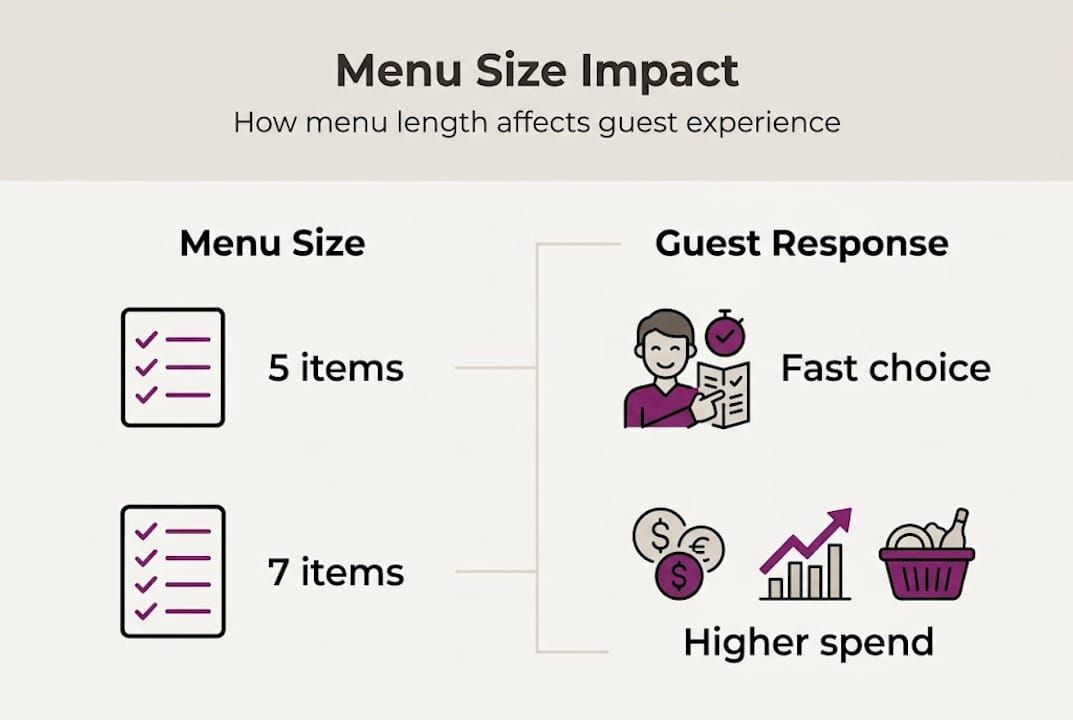
| Menu size | Guest decision time | Revenue per guest | Satisfaction score |
|---|---|---|---|
| 6 items per category | Shorter | Higher | Higher |
| 12+ items per category | Longer | Lower | Lower |
A focused menu also benefits your kitchen. Fewer items mean tighter inventory, less food waste, and faster ticket times. The wins stack up across the entire operation.
Here is how to trim your menu without losing what matters:
- Start with your Dogs. Items that are low in both popularity and profit are the easiest to cut.
- Consolidate similar dishes. If two items are nearly identical in profile, keep the one with the better margin.
- Test before you commit. Remove items from a digital menu first to see if guests notice or complain.
- Communicate changes positively. Frame a smaller menu as a sign of quality and focus, not limitation.
Pro Tip: Think of avoiding choice overload the same way you would think about streamlining a design project. Too many options slow everything down and dilute the impact of what really works.
Testing and optimizing your menu for results
Even evidence-backed menu changes perform best when they are tested for real results in your own unique setting. What works for a downtown bistro may not work for a family-style diner in the suburbs. That is why testing is not optional. It is the step that separates restaurants that improve consistently from those that redesign once and hope for the best.
Here is a practical testing process for small to medium-sized restaurants:
- Establish a baseline. Before making any changes, record your current average check, item sales mix, and revenue per table.
- Choose one variable to test. Start small. Try removing currency symbols, rewriting a dish description, or moving a Star item to the top of its category.
- Use digital menus for faster feedback. Digital menus let you A/B test changes without reprinting costs, and results come in faster.
- Run the test for at least 30 days. Short windows produce unreliable data, especially if your traffic fluctuates by season or day of week.
- Compare results against your baseline. Did average check go up? Did the tested item sell more? Did table turn time improve?
- Scale what works, drop what does not. Apply winning changes across the full menu and move on to the next test.
Quarterly menu engineering combined with regular A/B testing creates a cycle of continuous improvement. This approach is far more effective than one large redesign every few years. Small, frequent changes add up to significant revenue gains over time.
Pro Tip: Partner with a team that specializes in creative design updates to make sure your visual changes actually support the behavioral goals you are testing for. Design and data need to work together.
Our perspective: Menu design is your most overlooked sales tool
Now that we have covered step-by-step improvement strategies, let us challenge how most owners actually view their menus. In our experience working with restaurants and food-focused brands, the menu is almost always the last thing to get attention and the first thing that could move the needle.
Owners invest in paid ads, new signage, and seasonal events, but the menu sitting on every table during every service gets updated once a year at best. That is a missed opportunity. Your menu has a higher return on investment than almost any other marketing tool because it reaches every single guest at the exact moment they are ready to spend.
We believe menus should be treated like live campaigns. Review them the way you would review ad performance or social media engagement. Use data, test changes, and iterate. The branding specialists who help restaurants grow understand that a well-designed menu is not a static document. It is an ongoing conversation between your brand and your guest. When you commit to that mindset, the results compound in ways that discounts and promotions simply cannot match.
Take your restaurant to the next level with creative menu design
Your menu is working every shift, whether it is optimized or not. The difference between a menu that drives revenue and one that just lists dishes comes down to intentional design, smart data use, and professional execution.
At MyCali Designs, we help restaurant owners build menus that reflect their brand and convert at a higher rate. From business branding solutions to print and digital menu design, we bring both creative expertise and strategic thinking to every project. If you want to understand the full scope of what professional design can do for your restaurant, explore our branding FAQs to see how we approach each engagement. Let us help you build a menu that sells itself.
Frequently asked questions
Does menu design really impact sales?
Yes, research shows simple menu changes like removing currency signs can increase restaurant revenue by about 8 percent. Small design decisions have a measurable effect on guest spending behavior.
How often should I update my menu?
Best practice is to review and update your menu quarterly based on sales data and guest feedback. Quarterly menu engineering using POS data keeps your offerings aligned with what guests actually want and what drives your margins.
What is the ideal number of dishes per menu category?
Offering 5 to 7 items per menu category maximizes sales and prevents guest overwhelm. Fewer choices lead to faster decisions and higher satisfaction.
Is there a perfect place for profitable dishes on the menu?
Research finds guests read menus sequentially, left to right, so placing top sellers at the start of each section is the most reliable strategy. The Golden Triangle theory has been largely disproven by modern eye-tracking data.
Recommended
Recent Posts