



Visual Identity Checklist for SMBs: 2026 Guide
Visual Identity Checklist for SMBs: 2026 Guide
TL;DR:
- Building a recognizable brand requires a strategic foundation before designing visuals, ensuring consistency and intent. An adaptive logo system, purposeful color palette, and thoughtful typography are essential for effective, flexible branding across all platforms. Regular testing, documented guidelines, legal protection, and ongoing audits safeguard your brand's long-term value and recognition.
Building a recognizable brand without a visual identity checklist is like painting a room without masking the trim. You might finish the job, but the edges will show. Many small and medium-sized business owners dive into logo creation or color selection without first establishing the strategic foundation that makes every design decision intentional. The result is a disconnected look across platforms, inconsistent messaging, and a brand that customers struggle to remember. This guide walks you through each component of visual identity in checklist form, so nothing gets missed and nothing gets left to chance.
Key Takeaways
| Point | Details |
|---|---|
| Strategy before design | Clarify your brand mission, personality, and audience before touching a single visual element. |
| Color carries weight | Color influences up to 85% of consumer purchase decisions, making your palette one of the highest-impact choices you will make. |
| Logos need multiple versions | An adaptive logo system built for different sizes and platforms is a non-negotiable in multi-channel branding. |
| Test before you launch | A/B testing, surveys, and real-world context validation improve logo effectiveness before full rollout. |
| Legal protection matters | Trademarking your logo and creating documented branding guidelines protects your investment long-term. |
1. Start with strategy, not software
Before you open a design tool, you need answers to four foundational questions. These answers shape every visual decision that follows.
- What does your brand stand for? Write a one-sentence mission statement that your visuals must reflect. If your business prioritizes approachability and trust, your design choices should feel warm and clear, not cold and complex.
- Who is your audience? Age, income level, lifestyle, and values all influence visual preferences. A brand serving millennial wellness customers has a very different visual language than one serving industrial contractors.
- What is your brand personality? Think in adjectives: bold, playful, refined, grounded. Choose three to five. These words become your filter for every design decision.
- What are your visual identity goals? Do you need to attract new customers, reposition in the market, or create consistency across digital and physical touchpoints? Setting measurable goals keeps the process focused.
Pro Tip: Write your three brand personality adjectives at the top of every design brief. If a proposed logo or color palette does not match those words, it is not the right choice, no matter how good it looks on its own.
A foundational visual identity covering logo, colors, fonts, and guidelines can typically be completed in two to four weeks with focused effort. Strategy work done upfront cuts that timeline down because there is no guessing.
2. Build your logo with an adaptive system in mind
Your logo is not one file. It is a system. A single logo version fails across the range of contexts a modern brand operates in, from a small favicon to a large outdoor sign.
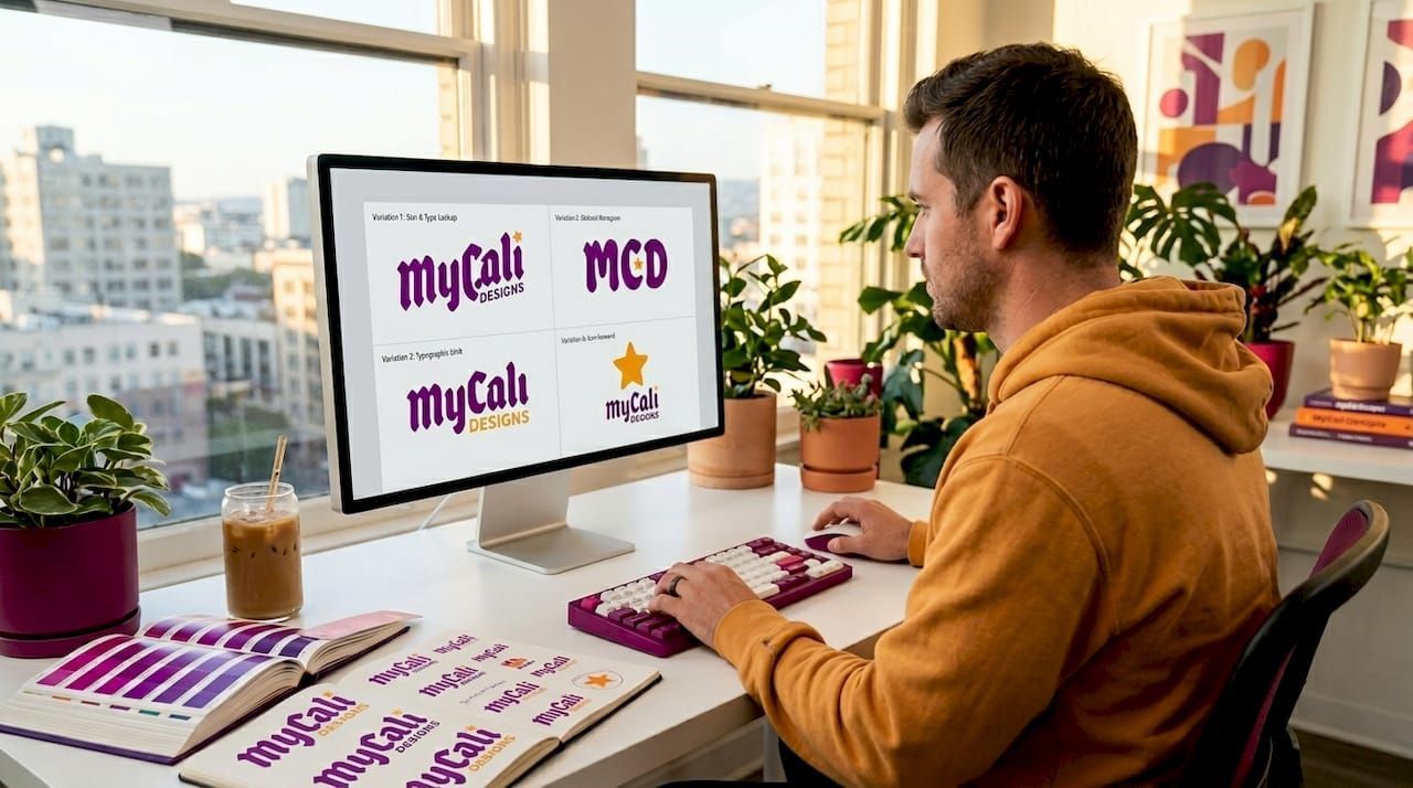
A strong adaptive logo system includes a primary version, a simplified secondary mark, a horizontal lockup, and a stacked version. Each is optimized for different sizes and placements. In 2026, this flexibility is considered a baseline requirement, not a premium upgrade.
On the style front, warm minimalism with subtle curves and muted palettes is the dominant trend. It balances simplicity with human warmth, making brands feel both modern and approachable. There is also a clear shift away from generic, AI-generated logo aesthetics toward handcrafted designs that reflect a specific community or personality. Your logo should look like you, not like every other business in your category.
Check out Mycalidesigns' logo design resource for a practical breakdown of what makes a logo work at every scale.
3. Define your color palette with purpose
Color is not decoration. 85% of purchase decisions are influenced by color, which means your palette is one of the most powerful parts of your brand style checklist.
Your color system should include three layers:
| Palette Layer | Role | Example Use |
|---|---|---|
| Primary colors | Core brand identity, used most frequently | Logo, main website header, packaging |
| Secondary colors | Support and variety without overwhelming | Accent elements, backgrounds, call-to-action buttons |
| Functional colors | Communication-specific purposes | Error messages, success indicators, alerts |
Color psychology matters here. Blue communicates trust and stability. Green suggests growth or health. Red creates urgency or energy. Understanding the psychology of color in marketing helps you choose hues that reinforce what you want customers to feel, not just what looks good on a mood board.
Pro Tip: Always check your brand colors for accessibility. Use a contrast checker to confirm your text-on-background combinations meet WCAG 2.1 AA standards. Accessibility is not optional, and it affects a wider audience than most business owners realize.
Document your colors in hex, RGB, and CMYK values. Never rely on visual approximation when sharing files with printers or developers.
4. Choose typography that works at every size
Typography is often the most underestimated element in a design identity guide. A poorly chosen font can undercut an otherwise strong visual system.
Your brand needs at minimum a primary typeface and a secondary typeface. The primary font carries your brand's personality and is used in headlines, logos, and prominent display contexts. The secondary font handles body copy and functional text. It should be highly readable at small sizes.
Consider these factors for each font choice:
- Personality fit : Does the font match your brand adjectives? A serif font reads as established and traditional. A clean sans-serif reads as modern and direct.
- Hierarchy support : Your font pairing should create clear visual hierarchy across headings, subheadings, and body text.
- Cross-platform performance : Test your fonts on screens and in print. Some fonts render poorly at certain resolutions.
- Accessibility : Minimum recommended body text size is 16px for digital. Avoid overly thin or decorative fonts for any text meant to be read, not just seen.
Include do's and don'ts in your branding guidelines. A font used at the wrong weight or stretched out of proportion can damage brand consistency just as much as using the wrong font entirely.
5. Establish imagery, iconography, and illustration guidelines
Photography and illustration are not afterthoughts. They are core components of visual identity that tell your brand story in ways that logos and colors cannot do alone.
For photography, define:
- Subject matter and approved themes (people, product close-ups, lifestyle scenes)
- Color treatment (bright and saturated vs. muted and film-like)
- Composition style (centered and clean vs. editorial and dynamic)
- What to avoid (stock photo clichés, overly posed scenarios, cluttered backgrounds)
For iconography, decide whether your brand uses line icons, filled icons, or a custom illustrated style. Icons should match the weight and personality of your typography. A brand using a bold, rounded font should not pair it with fine, angular icons. The mismatch creates visual noise.
Illustration style is optional for many SMBs, but if you use it, document it. Define line weight, color range, and subject matter. Using visual storytelling effectively means every visual element feels like it belongs to the same family.
The real discipline here is restraint. Consistency beats variety every time when you are building brand recognition.
6. Test your logo and key visuals before launch
Most SMBs skip this step entirely. That is a significant risk when so much brand investment rides on first impressions.
Testing logos before launch through A/B testing, surveys, user testing, and real-world context validation improves brand alignment and reduces the chance of a costly redesign later. Here is a practical approach to follow:
- Run a preference test : Show two or three logo concepts to a sample of your actual customers. Ask which one feels most like the brand you described to them in a single sentence.
- Test in context : Place your logo on a mock-up of your website header, a social media profile, a business card, and a tote bag. Context reveals problems that isolated file review misses.
- Assess the key questions : Does it read clearly at 32x32 pixels? Does it work in black and white? Does it communicate your brand personality without the name attached?
- Gather structured feedback : Use surveys with specific questions rather than open-ended "What do you think?" prompts. Ask whether the logo feels trustworthy, modern, friendly, or whatever your brand adjectives demand.
- Iterate before finalizing : One round of feedback rarely produces a final answer. Build at least one revision cycle into your timeline before committing to production files.
Pro Tip: Test your logo at thumbnail size on a phone screen first. If it does not read clearly there, it will not work anywhere. Mobile is the most unforgiving environment for logo clarity.
7. Create documented branding guidelines with anti-examples
A visual identity without documented guidelines is a system waiting to break down. The moment a second person, a contractor, a new employee, or a partner touches your brand assets, inconsistency begins.
Your branding guidelines should cover:
- Logo usage rules: clear space, minimum size, approved color variations
- Color codes: hex, RGB, and CMYK for every brand color
- Typography rules: approved fonts, weights, sizes, and hierarchy
- Imagery standards: photography style, approved themes, what to avoid
- Voice and tone alignment: how visual choices support the written brand voice
The most overlooked part of any brand style checklist is anti-examples. Documenting improper logo usage prevents misuse far more effectively than listing only positive rules. Show what happens when someone stretches the logo, places it on a clashing background, or uses an unapproved color version. A designer or team member who sees the wrong version visually is far less likely to repeat it.
"A documented visual identity system with clear do's and don'ts is not bureaucracy. It is the tool that protects every dollar you invested in your brand."
When you are unsure whether your current guidelines are thorough enough, use Mycalidesigns' brand identity resource as a reference point for what a complete system looks like.
8. Protect your identity legally and plan for brand audits
Creating brand assets is only half the job. Protecting them is the other half.
- Trademark your logo : Register distinctive logo elements with the USPTO to prevent competitors from using similar marks. A trademark gives you legal recourse if your identity is copied.
- Understand AI logo limitations : AI-generated logos often lack trademark viability and the exclusivity that professional design provides. If brand ownership and protection matter to you, professionally designed logos are the more defensible choice.
- Schedule brand audits : A brand audit is not just for large companies. Conducting regular audits helps you detect when your visual identity no longer aligns with your business stage or your audience's expectations. Signs you need one include inconsistent messaging across channels, customer confusion, or a general loss of confidence in how your brand looks.
- Know when to refresh : A refresh is not a failure. It is growth. If your brand has scaled significantly or shifted markets, your visual identity should reflect that. Use Mycalidesigns' brand readiness guide to assess where you stand.
Legal protection and periodic review are what separate a temporary brand from one that compounds in value over time.
My honest take on where SMBs go wrong
I have worked with a lot of business owners who arrive at the branding table with one thing: a logo they had made quickly and cheaply. No guidelines. No color system. No testing. Just a file they hoped would carry their brand forward.
What I have seen consistently is that skipping the testing and legal steps does not save time. It creates expensive problems later. A logo that was never tested in context often gets redesigned within two years. A brand without trademark protection is vulnerable the moment it gains real visibility.
The other pattern I notice is treating visual identity as a one-time task rather than a living system. Your brand will evolve. Your audience may shift. The market changes. The businesses that maintain strong brand equity are the ones who built a documented system from the start and revisit it intentionally, not just when something breaks.
My encouragement to you: invest the time upfront. Work through this checklist deliberately. A visual identity built on a solid foundation does not just look better. It performs better, holds up longer, and becomes a genuine business asset.
— Cesar
Build your visual identity with professional support
Working through a visual identity checklist is the right first step. Having an experienced team to execute it is what turns strategy into a brand that actually works in the real world. At Mycalidesigns, we have helped businesses at every stage develop logos, color systems, typography, and full branding guidelines that hold up across every platform and touchpoint. Whether you are starting from scratch or refining what you already have, our team brings both the design expertise and the strategic thinking your brand deserves. Explore our brand identity services to see how we can help you build something that lasts. You can also browse our logo design FAQs if you have specific questions about the process.
FAQ
What should a visual identity checklist include?
A visual identity checklist should cover brand strategy, logo design, color palette, typography, imagery guidelines, documented branding guidelines with anti-examples, testing protocols, and legal protection steps like trademarking.
How long does it take to build a visual identity?
A foundational visual identity covering logo, colors, fonts, and guidelines typically takes two to four weeks with focused effort and clear strategic direction from the start.
Why do I need an adaptive logo system?
An adaptive logo system provides coordinated versions optimized for different sizes and platforms, which is necessary for maintaining brand consistency across websites, social media, print, and signage.
Should I trademark my logo?
Yes. Trademarking your logo provides legal protection and exclusivity. AI-generated logos often cannot be trademarked, so professionally designed logos are the stronger choice for long-term brand protection.
When should I conduct a brand audit?
Conduct a brand audit when you notice inconsistent messaging, customer confusion, or when your visual identity no longer reflects your current business stage or audience.
Recommended
Recent Posts