




Understanding Visual Communication for Business Growth
Understanding Visual Communication for Business Growth

TL;DR:
- Visual communication uses images, color, and layout to deliver messages faster and more memorably than text.
- Consistent visual elements build brand recognition, trust, and customer engagement across all marketing channels.
Visual communication is the deliberate use of images, typography, color, and layout to convey messages clearly and memorably. The human brain processes visuals 60,000 times faster than text. That single fact explains why your logo, website design, and marketing graphics do more persuasive work in one second than a paragraph of copy ever could. For business owners and professionals, understanding visual communication is not a creative luxury. It is a core business skill that directly shapes how customers perceive, trust, and buy from you.
What are the core elements of visual communication?
Visual communication, known in design practice as visual language , is built from a set of repeatable elements. Each one carries meaning on its own. Together, they create the full message your audience receives before they read a single word.
The foundational elements are:
- Images and photography: Real photos build credibility. Illustrations and icons simplify abstract ideas and work across language barriers.
- Typography: Font choice signals personality. A serif font reads as established and trustworthy. A clean sans-serif reads as modern and direct.
- Color: Color triggers emotional responses before conscious thought kicks in. Red signals urgency. Blue signals reliability. Green signals growth or health.
- Layout and whitespace: How you arrange elements on a page guides the eye. Whitespace is not empty space. It is breathing room that makes key messages stand out.
- Icons and symbols: A well-designed icon communicates a concept instantly. Think of the universal "play" button or a shopping cart icon.
- Charts and data visualizations: Numbers become understandable when visualized. A bar chart communicates a trend faster than a table of figures.
- Motion graphics and video: Motion graphics simplify complex ideas and hold audience attention longer than static content. They are especially effective in social media and product explainer contexts.
Consistency across all these elements is what builds brand recognition. When your fonts, colors, and image style stay the same across every touchpoint, customers start to recognize you without reading your name. That recognition is the foundation of trust. The role of design in marketing depends almost entirely on how well these elements work together.
What are effective visual communication techniques for marketing and branding?

Strong visual communication does not happen by accident. It follows deliberate principles that professional designers apply to every project.
Use information design to guide attention
Information design uses hierarchy, organization, and visual cues to eliminate ambiguity and direct users toward key actions. On a landing page, that means your headline is the largest element, your call to action is the most visually distinct button, and supporting details sit in a smaller type size below. The eye follows a path you set intentionally.
Simplify before you decorate
The most common mistake business owners make is adding visual elements to fill space. Excessive decoration distracts and reduces accessibility. Every graphic element should earn its place by clarifying the message, not decorating it. Strip your designs down to what is necessary, then test whether the message is clearer. It almost always is.
Build a design system
Design systems define rules for spacing, typography, and color to create a mental shorthand that users recognize quickly. A design system is not just a style guide. It is a decision-making framework that keeps every piece of content visually consistent, whether it is a social media post, a business card, or a website page. The visual branding process for small and mid-size businesses follows exactly this logic.
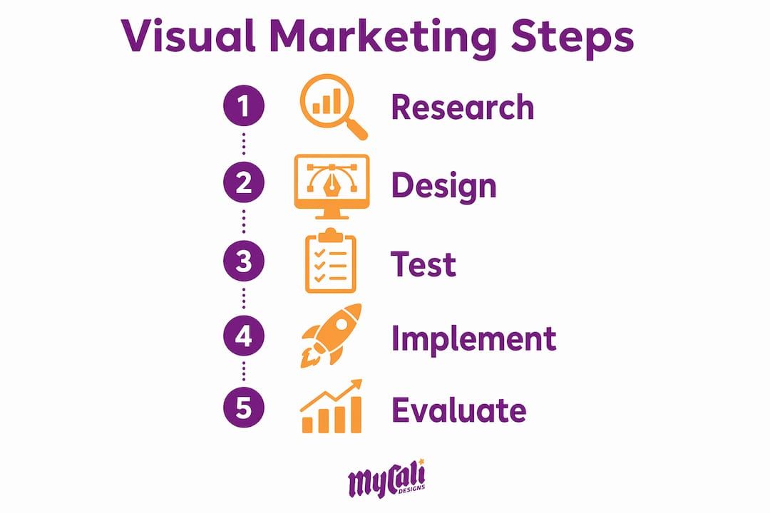
Here is a practical sequence for applying these techniques:
- Define your visual hierarchy. Decide what the viewer should notice first, second, and third on every design.
- Choose a limited color palette. Three to five colors is enough. More than that creates visual noise.
- Select two typefaces maximum. One for headlines, one for body text. Mixing more creates inconsistency.
- Apply the same layout grid across all materials. Consistent margins and column widths make your brand feel organized and professional.
- Use contrast and emphasis deliberately. Bold one key phrase per section. Use a contrasting color for your primary call to action only.
Pro Tip: Apply the "squint test" to every design. Squint until the details blur. Whatever still stands out is your visual hierarchy. If nothing stands out, your design lacks emphasis and needs revision.
Effective visual storytelling also creates emotional connection. Visual storytelling tips show that brands using narrative-driven imagery build stronger audience loyalty than those relying on product shots alone. Show the customer's outcome, not just the product.
How does visual communication improve business outcomes and customer engagement?
The business case for strong visual communication is direct. Visuals improve comprehension, build trust, and reduce the friction that stops customers from making decisions.
Visuals improve long-term memory retention compared to text-only communication. That means a customer who sees your branded infographic is more likely to remember your offer a week later than one who only read a text description. Memory retention translates directly into repeat visits, referrals, and conversions.
Visual hierarchy guides user focus toward conversion points. A well-structured product page with a clear visual path from headline to benefit to call to action outperforms a cluttered page every time. This is not a design preference. It is a measurable business outcome.
The benefits extend further:
- Brand trust: Consistent visual identity signals professionalism. Customers equate visual consistency with operational reliability.
- Faster decision-making: Clear visuals reduce cognitive load. When a customer does not have to work hard to understand your offer, they decide faster.
- Inclusive marketing: Visual communication transcends linguistic and cultural barriers, making your brand accessible to global and multilingual audiences without requiring separate campaigns.
- Team alignment: Internally, visual communication helps teams align on complex processes faster than written documentation alone.
- Higher engagement: Visual content drives significantly more views than text-only content across digital marketing channels.
The graphic design essentials that support these outcomes are not reserved for large brands with big budgets. Small and mid-size businesses that invest in consistent visual identity see the same trust and engagement gains.
What are practical steps to implement visual communication in your marketing?
Knowing the principles is one thing. Putting them into practice across your business is another. These steps give you a clear path forward.
- Audit your current visual assets. Collect every piece of branded material you use: your logo, website, social profiles, email templates, and printed materials. Look for inconsistencies in color, font, and image style. Inconsistency is the most common and most damaging visual communication problem for growing businesses.
- Establish a visual identity document. Write down your brand colors (with exact hex codes), your approved fonts, your logo usage rules, and your image style guidelines. This document becomes the reference point for every design decision.
- Integrate visuals across all marketing channels. Your Instagram post, your email header, and your website banner should feel like they come from the same brand. Cohesion across channels reinforces recognition at every touchpoint.
- Test with real users. Testing visuals with real users improves clarity and aligns messaging with audience expectations. Show your designs to people outside your team before publishing. Ask them what they notice first and what the design is asking them to do.
- Add motion graphics where they serve the message. Short animated explainers on your homepage or product pages can increase time on page and reduce bounce rates. Use motion to clarify, not to impress.
The visual identity checklist for small and mid-size businesses is a practical starting point for any business that wants to formalize this process.
Key Takeaways
Effective visual communication combines deliberate design choices, consistent visual systems, and audience-tested clarity to build trust, improve comprehension, and drive measurable business results.
| Point | Details |
|---|---|
| Visuals outpace text in speed | The brain processes images 60,000 times faster than text, making design your fastest persuasion tool. |
| Simplicity beats decoration | Stripping designs to their essential message improves comprehension and accessibility every time. |
| Design systems build recognition | Consistent rules for color, type, and spacing create brand patterns that customers recognize and trust. |
| Visual hierarchy drives conversions | Deliberate size, contrast, and whitespace guide the eye toward the actions you want customers to take. |
| Testing closes the gap | Real-user testing reveals whether your visuals communicate what you intend, before they go live. |
What I have learned from years of watching businesses get visual communication wrong
Most business owners treat visual communication as the last step in their marketing process. They write the copy, plan the campaign, and then ask someone to "make it look good." That sequence produces weak results every time.
Visual communication is a strategic tool that combines creativity with intent. The design decisions you make at the start of a project shape how every subsequent message lands. When you treat visuals as decoration, you are essentially asking your audience to work harder to understand you. Most of them will not bother.
The other misconception I see constantly is that consistency is boring. Business owners want to refresh their look frequently because they are tired of seeing the same colors and fonts. But your customers are not seeing your brand as often as you are. Consistency is what builds the recognition that makes your marketing feel familiar and trustworthy rather than random.
The businesses that get visual communication right treat it the way they treat their financial systems: with documented rules, regular audits, and a clear owner responsible for maintaining standards. That discipline is what separates brands that customers remember from brands that blend into the background.
The opportunity in 2026 is real. Motion graphics, short-form video, and AI-assisted design tools have made high-quality visual communication more accessible than ever. The businesses that build strong visual foundations now will compound that advantage as these tools become standard across every industry.
— Cesar
How Mycalidesigns helps you build visual communication that works
Strong visual communication starts with a strong visual identity, and that starts with your logo and brand system.
At Mycalidesigns, we have built logo and branding systems for businesses that needed more than a pretty mark. They needed a visual language that works across their website, their marketing materials, and their customer touchpoints. We bring the same design discipline described in this article to every project: clear hierarchy, consistent systems, and designs tested against real business goals. If your current visuals are inconsistent or not converting, we can help you fix that with a process that is clear, collaborative, and built for growth.
FAQ
What is visual communication in simple terms?
Visual communication is the use of images, color, typography, and layout to convey a message without relying solely on words. It is how your brand speaks before anyone reads your copy.
Why does visual communication matter for business?
Strong visual communication builds brand trust, speeds up customer decision-making, and improves memory retention of your message. Businesses with consistent visual identities are perceived as more professional and reliable.
What are the main elements of visual communication?
The core elements are images, typography, color, layout, icons, data visualizations, and motion graphics. Each element contributes to how your audience perceives and understands your message.
How do I improve my business's visual communication?
Start by auditing your existing brand materials for consistency, then establish a documented design system covering colors, fonts, and layout rules. Test your designs with real users before publishing to confirm the message lands as intended.
What is a design system and why does a small business need one?
A design system is a documented set of rules for how your brand looks across all materials, covering spacing, typography, and color. It reduces inconsistency, speeds up content creation, and builds the visual recognition that drives customer trust.
Recommended
Recent Posts