
How to design a restaurant website that attracts more customers
How to design a restaurant website that attracts more customers
Your restaurant could serve the best food in town, but if your website is slow, hard to navigate on a phone, or missing a clear "Order Now" button, you are quietly losing customers every single day. Over 70% of restaurant website traffic comes from mobile devices, and that number climbs to 78% in some markets. A website that does not work seamlessly on a phone is not just frustrating for visitors—it is actively costing you orders. This guide walks you through every stage of building or improving your restaurant website, from setting clear goals to optimizing for speed, mobile, and conversions that actually move the needle.
Table of Contents
- Preparing for website design: Key requirements and tools
- Building your website: Step-by-step execution
- Optimizing for conversions: CTAs, mobile, and speed
- Troubleshooting & avoiding common mistakes
- A fresh perspective: Why simple, focused sites win
- Next steps: Boost your restaurant website with expert help
- Frequently asked questions
Key Takeaways
| Point | Details |
|---|---|
| Mobile-first design | Restaurant websites must be built for mobile users to avoid losing orders and maximize reach. |
| Fast load speeds | Keeping load times under 3 seconds dramatically increases conversions and prevents abandonment. |
| Sticky, prominent CTAs | Visible and persistent call-to-action buttons drive more orders and reservations. |
| Direct ordering advantages | Direct online ordering ensures you keep profits and own valuable customer data for repeat business. |
| Function over flash | Prioritize usability and speed rather than fancy animations to deliver the best user experience. |
Preparing for website design: Key requirements and tools
Now that you see the importance of a strong website, let us outline what you need to get started. Before any design decisions happen, you need to be crystal clear on what your site must accomplish. A restaurant website is not a digital brochure—it is a sales tool. Treat it like one.
Define your core goals first
Every restaurant website should be built to do at least four things well:
- Drive online reservations and reduce phone call volume
- Enable direct online ordering without third-party markups
- Showcase your menu clearly with photos and pricing
- Deliver a fast, intuitive experience on any mobile device
When you start with these goals locked in, every design choice becomes easier to evaluate. You can ask a simple question before adding any feature: does this help the site do its job better? If the answer is no, skip it.
Direct ordering vs. third-party platforms: Know the difference
One of the most important decisions you will make involves how you handle online orders. Many restaurants default to third-party apps like DoorDash or Grubhub, but this comes at a real cost. Here is how the two options compare:
| Feature | Direct ordering on your site | Third-party platforms |
|---|---|---|
| Commission fees | 0% (only payment processing ~2-3%) | 15-30% per order |
| Customer data ownership | Full access | Platform owns the data |
| Marketing opportunities | Build your own email and loyalty lists | Limited to platform tools |
| Brand experience | Fully controlled | Generic, platform-branded |
| Reach for new customers | Lower initial discovery | Higher discovery potential |
Direct ordering keeps more money in your pocket and, critically, gives you ownership of customer data. That data is the foundation of email marketing, loyalty programs, and repeat business. Third-party platforms are useful for discovery, but they should not be your only ordering channel.
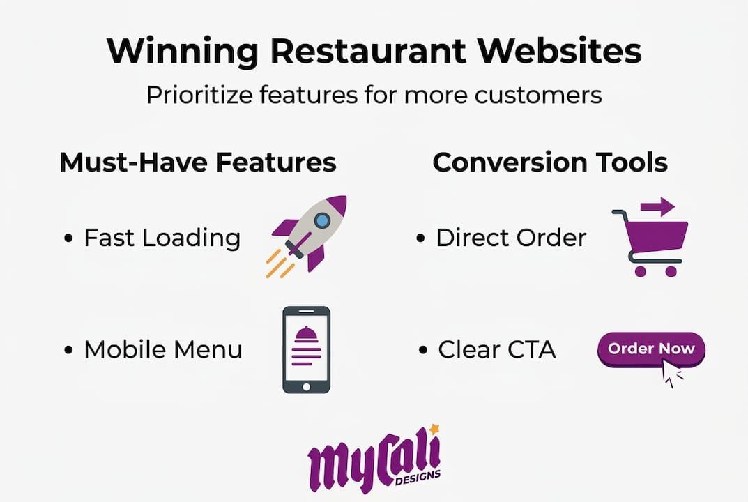
Must-have features for any restaurant website
Use this checklist when planning or auditing your site. Refer to our small business website guide for a broader look at what a strong site foundation looks like.
- ✅ Mobile-responsive design that adapts to any screen size
- ✅ Fast load times under 3 seconds on mobile networks
- ✅ Clear, readable menu with categories, photos, and pricing
- ✅ Prominent CTAs such as "Order Now," "Reserve a Table," or "View Menu"
- ✅ Contact information including address, phone, hours, and a map embed
- ✅ Online reservation integration (OpenTable, Resy, or a direct form)
- ✅ Social proof in the form of reviews, awards, or press mentions
- ✅ SSL certificate so your site loads as secure in browsers
For more on how your website can support customer engagement beyond just food orders, our restaurant website engagement tips offer practical, real-world strategies. And when it comes to presenting your offerings, following menu design best practices can meaningfully increase average order values.
Pro Tip: When prioritizing features, always favor function over flash. A clean, fast-loading menu page with a bold "Order Now" button will outperform a beautifully animated homepage that takes five seconds to load every single time.
Building your website: Step-by-step execution
Once requirements are clear, it is time to execute. Here is how to actually build your site for results, from choosing the right platform to going live with confidence.
Step-by-step: Building a restaurant website that converts
-
Choose your platform. For most restaurants, WordPress with a restaurant-focused theme, Squarespace, or a dedicated restaurant website builder like Toast or BentoBox will work well. Choose based on your technical comfort level and need for integrations.
-
Create a wireframe before designing. A wireframe is a simple sketch or digital layout that shows where each element goes on the page. Think of it as the floor plan before you build the dining room. Nail the layout before touching colors or fonts.
-
Gather high-quality assets. This means professional food photography, your logo in multiple formats, and written menu copy that is already formatted for web. Blurry photos and inconsistent fonts are silent trust-killers.
-
Build your core pages. Every restaurant site needs at minimum: a homepage, a full menu page, an about page, a contact and location page, and an online ordering or reservation page.
-
Add CTAs on every page. Every page should have at least one clear, action-driving button. Do not make visitors hunt for how to order or reserve.
-
Integrate key tools. Connect your reservation system, online ordering platform, Google Analytics, and social media feeds before launch.
-
Test responsiveness across devices. Open your site on an iPhone, an Android phone, and a tablet. Check every page. Forms, buttons, and menus should all work flawlessly.
Speed and conversion benchmarks to know
Page load times under 3 seconds are non-negotiable. Here is exactly what the data tells us:
| Metric | Benchmark | Impact |
|---|---|---|
| Ideal page load time | Under 2 seconds | Highest conversion rate |
| Maximum acceptable load time | 3 seconds | 53% abandon above this |
| Conversion loss per 1-second delay | 7% reduction | Measurable revenue impact |
| Conversion rate advantage | 2.5-3x higher | Fast sites vs. slow sites |
These numbers are not abstract. If your site takes 4 seconds to load on mobile and you are doing $15,000 a month in online orders, a 1-second improvement could realistically add over $1,000 in monthly revenue just from reduced abandonment. Speed is not a technical nicety. It is a revenue driver.
Our guide on website conversion strategies goes deeper on turning visitors into paying customers beyond just page speed.
Pro Tip: Before finalizing your CTAs and value propositions, run A/B tests. Show 50% of visitors one version of your homepage headline and 50% another. Even small wording changes like "Order fresh today" vs. "Order now, ready in 20 minutes" can swing conversion rates significantly. Most website platforms make this straightforward to set up.
Optimizing for conversions: CTAs, mobile, and speed
With your site live, here is how to refine it for maximum orders and reservations. Getting a site built is only half the battle. The other half is making sure every visitor who lands on your page feels compelled to take action.
CTA placement: Where buttons go matters enormously
Sticky, prominent CTAs like "Order Now" or "Reserve a Table" placed above the fold on every page can boost conversions by 34 to 83%. That is not a small gain. That is the difference between a site that quietly collects visits and one that actively drives revenue.
Here is where CTAs should live on your restaurant website:
- Above the fold on the homepage (visible without scrolling on any device)
- Sticky header or footer bar that stays visible as users scroll
- At the bottom of every menu section so the path from browsing to ordering is immediate
- On the contact and about pages because visitors there are clearly interested and ready to act
- In any confirmation emails or post-ordering pages to encourage repeat visits
For additional guidance on placing CTAs strategically, explore our notes on smart CTA placement across your digital presence.
Mobile usability tweaks that make a real difference
A mobile-friendly site is not just about making your desktop site shrink to fit a phone screen. True mobile optimization means rethinking the experience entirely for touch and small displays. Key adjustments include:
- Buttons sized at least 44x44 pixels so they are easy to tap with a thumb
- Font sizes no smaller than 16px for body text
- No horizontal scrolling on any page
- Simplified navigation with a hamburger menu or bottom tab bar
- One-tap calling from your phone number field
Speed enhancements worth implementing today
"A delay of 1 second can reduce conversions by 7%." This is not a theoretical risk for restaurants—it is a measurable hit to your bottom line every single week.
To keep your site fast, prioritize:
- Image compression using tools like TinyPNG before uploading photos
- Caching plugins if you are on WordPress (WP Rocket or W3 Total Cache)
- A reliable content delivery network (CDN) to serve files from servers near your visitors
- Minimal use of third-party scripts like chat widgets or pop-up tools that slow load times
- Regular audits using Google PageSpeed Insights or GTmetrix to catch regressions early
Pairing strong speed performance with solid local search presence is essential. Our SEO for restaurant websites overview explains how technical site health and search visibility connect directly.
Pro Tip: Place your primary CTA above the fold and make it sticky on scroll. If a visitor has to scroll down to find "Order Now," many of them will not bother. Reduce that friction and your conversion rate will respond almost immediately.
Troubleshooting & avoiding common mistakes
Finally, anticipate the issues that trip up even well-planned restaurant websites. Here is how to fix them and avoid costly mistakes before they affect your bottom line.
The most frequent restaurant website mistakes
Restaurants make the same design errors repeatedly, and most of them are avoidable:
- ❌ Slow load times caused by uncompressed hero images or too many third-party scripts
- ❌ Non-responsive mobile layouts where text overflows, buttons are too small, or menus are impossible to read
- ❌ Confusing or buried CTAs where "Order Now" appears only on the contact page after several clicks
- ❌ Outdated branding with mismatched fonts, old logos, or photography that no longer reflects the restaurant
- ❌ Incomplete or hard-to-read menus without photos, missing prices, or no mobile-friendly formatting
- ❌ Missing local SEO signals like a Google Business Profile link, embedded map, or structured data markup
- ❌ Broken links or outdated hours that erode customer trust immediately
The function over flash principle is one that we return to again and again with restaurant clients. Speed and mobile experience will always outperform fancy parallax scrolling or video backgrounds when it comes to real-world conversions. A beautiful site that loads slowly is simply a frustrating site.
How to stay on top of ongoing maintenance
Your website is not a one-time project. Treat it as a living asset that needs regular attention:
- Monthly: Check that all CTAs work and link to the correct pages
- Quarterly: Run a full speed audit and update your menu if anything has changed
- Seasonally: Refresh your photography to reflect current offerings and any decor changes
- Annually: Review your overall site design against what competitors are doing
Keeping your menu visibility high and your content fresh signals to both customers and search engines that your restaurant is active and well-managed.
Pro Tip: Every quarter, ask a real customer (not a staff member) to complete a task on your website—find the menu, place an order, or make a reservation. Watch them do it without guiding them. You will discover friction points faster than any analytics tool. This kind of real-world testing is invaluable, and it costs you nothing but a coffee and thirty minutes.
For a broader look at design decisions that hold restaurants back, our resource on avoiding design mistakes covers the issues we see most often across service-based businesses.
A fresh perspective: Why simple, focused sites win
After covering practical steps and troubleshooting, let us look at what really separates successful restaurant sites from the rest. In our experience working with restaurant owners and service businesses, the single biggest trap is mistaking a beautiful website for an effective one. These two things are not the same.
Restaurants with the highest-converting sites are rarely the ones with the most elaborate designs. They are the ones where a hungry person on a phone can find the menu in one tap, see a "Order Now" button immediately, and complete an order in under two minutes. That is it. That simplicity is the strategy.
Most restaurant owners overinvest in visual effects and underinvest in speed and clarity. We understand why—visual design is exciting and tangible. But a slow, visually impressive site loses to a fast, straightforward one every time, because customers are not there to admire your website. They are there to eat.
There is also a powerful business case for owning your ordering channel through direct integration. When you control the ordering flow, you collect customer emails, order histories, and behavioral data that fuel repeat business. That is a genuine competitive advantage that no third-party platform will build for you.
Commit to conversion-focused design from the start. Build lean, build fast, and keep the customer's path to checkout as short as possible.
Next steps: Boost your restaurant website with expert help
Ready to elevate your site? Professional support can streamline the entire process and help you avoid the costly trial-and-error that comes with DIY builds.
At Mycali Designs, we work with restaurant owners and service businesses to build websites that are fast, conversion-focused, and built around your brand. Whether you need a full custom website development project, a refresh of your visual identity through restaurant branding services , or a complete package that covers design and search visibility through our website and SEO solutions , we bring a structured, collaborative approach to every engagement. You focus on running your restaurant. We handle the strategy, design, and execution that turns your website into a customer acquisition tool that works around the clock.
Frequently asked questions
How important is mobile design for restaurant websites?
Mobile-friendly design is critical: over 70% of restaurant traffic comes from mobile devices, and non-responsive sites lose 42% more orders compared to optimized ones.
What website load speed should I target?
Aim for page load times under 3 seconds, ideally closer to 2 seconds. 53% of users abandon sites that take longer than 3 seconds, and even a 1-second delay cuts conversions by 7%.
Does using direct online ordering really benefit restaurants?
Yes, direct ordering means you keep all proceeds minus standard payment processing fees and, more importantly, you own your customer data for marketing, which third-party platforms do not share.
What is the best placement for call-to-action buttons?
Place CTAs like "Order Now" or "Reserve" above the fold and make them sticky on every page. Prominent sticky CTAs have been shown to boost conversions by 34 to 83% across restaurant websites.
Recommended
Recent Posts