
Visual identity process for manufacturers: A step-by-step guide
Visual identity process for manufacturers: A step-by-step guide
TL;DR:
- A strong visual identity in manufacturing signals credibility, reduces sales friction, and builds trust before conversations begin.
- Proper strategy, testing across touchpoints, and outside expertise are essential to creating consistent, effective branding.
Walk into a trade show, open a catalog, or visit a manufacturer's website, and within seconds you are making a judgment about whether that company can be trusted with your business. For manufacturing executives, the visual identity process for manufacturers is not a cosmetic exercise. It is a direct factor in whether prospects move forward or quietly choose a competitor whose brand simply looks more credible. This guide breaks down the full process, from brand foundations to real-world testing, so you can build a visual presence that earns trust before a single sales call happens.
Key Takeaways
| Point | Details |
|---|---|
| Visual identity builds trust | A consistent visual identity signals professionalism that reduces sales friction in manufacturing. |
| Strategy before design | Establish brand values and positioning before starting logo and visual design work. |
| Design with precision | Use geometry and semiotics to create meaningful manufacturer logos that reflect core brand ideals. |
| Test before launch | Beta test identity elements in real contexts to refine and ensure effectiveness. |
| Avoid execution inconsistency | Cover all touchpoints with brand guidelines to maintain recognition and trust over time. |
Understanding the importance of visual identity in manufacturing
Manufacturing is a relationship-driven industry. Procurement managers, plant directors, and operations leads are often making six or seven-figure decisions, and they carry real personal risk when they select a supplier. In that environment, your brand is not decoration. It is a risk-reduction signal.
"Visual coherence across touchpoints signals professionalism and reduces sales friction in manufacturing B2B decisions."
Think about what happens when a buyer encounters your sales deck, your website, your packaging, and your trade show booth, and none of them look like they belong to the same company. The message they receive is not neutral. It suggests disorganization, and disorganization in a manufacturer raises serious flags. Brand consistency compounds over time, meaning every consistent impression stacks on the last one and slowly builds recognition.
Here is what a strong visual identity actually does for a manufacturer:
- Builds credibility before the first call. A buyer who visits your website and sees a polished, consistent visual system subconsciously categorizes you as low-risk.
- Shortens the sales cycle. Familiar, professional visuals reduce the mental friction buyers feel when evaluating vendors.
- Differentiates you in commodity markets. When your product specs are similar to competitors, brand perception becomes a genuine differentiator.
- Supports your team. Sales reps close deals faster when the materials they hand over reflect a company that looks the part.
Manufacturers often underestimate the importance of visual identity in manufacturing because the product does the heavy lifting in their minds. But the product only gets evaluated after the brand earns enough trust for the conversation to happen. A thorough visual identity guide can help clarify where your current brand may be losing ground.
Preparing your manufacturer brand foundations before design
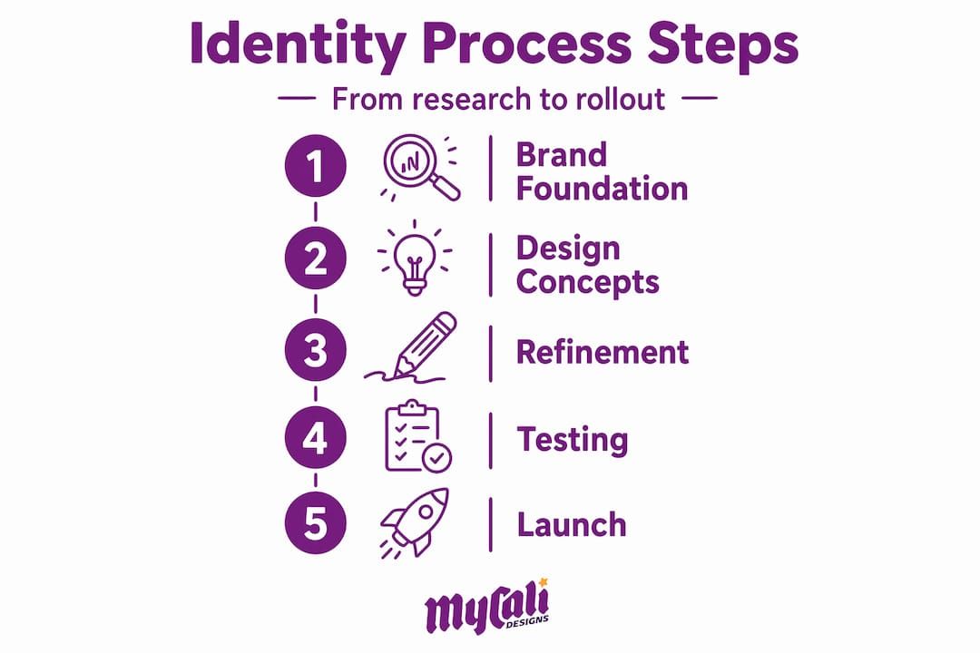
Here is where most manufacturers make their first and most costly mistake. They jump straight into logo design without doing the strategic groundwork. The result is a logo that looks fine in isolation but carries no meaning, fits no context, and fails to differentiate. Strategy must precede visual design ; naming and positioning inform logo creation using semiotics and precise design methods.
Think of brand foundations as the blueprint before the build. You would not construct a facility without engineering specs. The same logic applies here.
Step-by-step foundation process:
- Conduct stakeholder interviews. Talk to your leadership team, your sales reps who are on the front lines, and your best customers. Ask each group what words come to mind when they think of your company. The gaps between those three groups often reveal where your brand is working and where it is not.
- Research the competitive landscape. Map out how your main competitors present themselves visually. Look for patterns you want to distance yourself from and white space you can own.
- Define your core brand values. Narrow it down to three to five values that genuinely guide decisions inside your company. Generic values like "quality" and "integrity" are useless without specific proof points attached.
- Write a clear positioning statement. This is not a tagline. It is an internal document that specifies who you serve, what you provide, and why you are the better choice. Every design decision should trace back to this statement.
- Choose a brand archetype. Archetypes are a tool borrowed from psychology that help align brand personality with buyer expectations. A precision parts manufacturer might align with the Ruler archetype (authority, control, reliability), while a custom fabrication shop might lean toward the Creator (craft, originality, vision).
Supporting brand development resources can accelerate this work. We recommend reviewing proven branding strategies for manufacturers and using a solid branding preparation checklist to make sure nothing is skipped. An effective brand strategy is the difference between a visual identity that resonates and one that is just another logo.
Executing the visual identity design process step-by-step
With your brand foundations documented, the design phase has clear direction. This is where manufacturing visual branding techniques meet strategic intent.
The design execution sequence:
- Logo design using geometry and semiotics. Semiotics is the study of signs and symbols and how they communicate meaning. A shape is never neutral. Circles suggest unity and continuity. Angles suggest precision and forward motion. The Venturus "V" logo used geometry, semiotics, and Golden Ratio precision, blending warmth and precision through shape and typography contrast. That level of intentionality is what separates a meaningful manufacturers logo design process from a generic mark.
- Typography selection. Your typeface communicates before anyone reads a single word. A sans-serif with tight tracking communicates precision and modernity. A slightly humanist sans-serif (one with subtle curves that feel hand-influenced) can communicate the same precision while remaining approachable. Select a primary typeface and a secondary typeface, and define specific use cases for each.
- Color palette development. Color carries psychological weight that works whether your audience is conscious of it or not. Navy and steel gray signal reliability and authority. Amber or orange can signal energy and craft. Define a primary color, a secondary color, and at least one neutral. Then document the exact hex, RGB, and CMYK (Cyan, Magenta, Yellow, Key/Black) values for each so no one guesses.
- Build the full visual system. This goes beyond a logo. It includes icons, photo style guidelines, layout grids, and usage rules for digital and print. Building visual identity in manufacturing means accounting for every touchpoint where your brand appears.
| Design element | What it communicates | Common mistake |
|---|---|---|
| Logo geometry | Core brand values and personality | Generic shapes with no strategic rationale |
| Typography | Tone, professionalism, approachability | Using too many fonts across materials |
| Color palette | Emotion, positioning, differentiation | Inconsistent color values across media |
| Icon and illustration style | Visual cohesion and brand voice | Mixing styles pulled from different sources |
| Photo treatment | Quality and authenticity | Using stock photos that contradict brand values |
Pro Tip: Design your logo at a small size first, around 32 pixels wide, before you refine the full version. If it holds together at that size, it will work everywhere. If it falls apart, your design is too complex and buyers will not recognize it at a glance.
For a deeper look at the manufacturers logo design process and what makes a logo build real trust, we recommend reading how to design a logo and understanding how a logo impacts trust.
Verifying and refining your visual identity through real-world testing
Finishing the design is not finishing the process. This is where many manufacturing brands stall. They approve the logo, print business cards, and consider it done. Then they discover six months later that the logo looks blurry on embroidered workwear, the colors print inconsistently on packaging, and the typography breaks in email signatures.
Beta testing visual identities on real applications refines geometry and typography before launch and avoids common failures that are expensive to correct after rollout.
Here is a practical testing checklist for manufacturing contexts:
- Print media. Test on letterhead, business cards, brochures, and large-format banners. Check that color values are accurate in CMYK and that fine logo details hold at small print sizes.
- Digital applications. Test on your website header, email signature, social media profile images, and digital ads. Check that font embedding is consistent and that colors render correctly in both light and dark backgrounds.
- Physical applications. Apply the mark to workwear, vehicle decals, trade show displays, and equipment labels. These are the contexts buyers encounter in person, and they carry significant credibility weight.
- Internal materials. Slide decks, proposals, and sales leave-behinds are often the last thing a prospect reviews before making a decision. Test the identity across all of these.
- Feedback collection. Show materials to a small group of customers and internal team members. Ask direct questions: Does this feel like us? Would you trust this company? What does this color or shape make you think of?
After gathering feedback, refine color hierarchy (which color draws the eye first), adjust typography weights for better readability, and tighten spacing rules. Then document every final decision in your visual identity guidelines for producers and teams. Follow the complete branding execution checklist to make sure every application is covered before you go live.
Pro Tip: Build case studies using your new brand visuals before the official launch. They serve double duty: you stress-test the identity in real content, and you create SEO-driven material that starts building buyer relationships before your first sales conversation.
Why most manufacturers struggle with visual identity — and how to avoid it
We have worked with enough manufacturing clients to recognize the pattern. The problem is rarely talent or budget. It is a gap between intention and execution.
Most manufacturers invest in a logo and consider brand identity development for manufacturers complete. They stop there. No guidelines document. No defined rules for how the identity applies to trade show graphics, packaging, or digital ads. Six months later, each department is using a slightly different version of the logo, pulling colors from memory, and choosing fonts that feel close enough. Execution inconsistency across touchpoints is the main cause of visual identity failure in manufacturing.
The second failure point is skipping real-world testing entirely. A logo that looks great in a design file can become unrecognizable when stitched onto a jacket or scaled down for a mobile browser. Testing is not optional. It is the quality control stage of brand development, and manufacturers of all industries understand what happens when you skip QC.
The third issue is the "too many cooks in the kitchen" problem. Brand decisions get made by committee, which means no single person owns the strategic direction. The result is a visual identity that tries to please everyone and ends up speaking clearly to no one. One stakeholder wants bold and industrial. Another wants friendly and accessible. Without clear positioning and a decisive process, those competing instincts pull the identity in opposite directions.
Our perspective: internal teams bring invaluable context about company culture, product strengths, and customer relationships. What they often lack is the external vantage point needed to see how the brand reads to someone who does not already know and trust the company. That is where outside expertise earns its value. Reviewing the full visual branding process with fresh eyes almost always surfaces blind spots that internal teams have normalized.
Branding is not a design project. It is a strategic alignment between how you see your company and how your buyers need to perceive it. Get that alignment right, and design becomes the natural expression of something that already makes sense.
How MyCali Designs supports manufacturers in building compelling visual identities
Knowing the process is one thing. Executing it consistently, with the right expertise at each stage, is another challenge entirely.
At MyCali Designs, we partner with manufacturing businesses to build brand identities that do real work. From positioning and strategy to the manufacturers logo design process, full visual system creation, and launch, we handle every stage. Our team uses the same principles covered in this guide, including geometric precision, semiotics, and real-world testing, to create identities that hold up across every touchpoint your buyers encounter. Whether you need a complete custom brand identity built from the ground up, answers to common logo design questions , or a full review of your current brand, our branding and design services are built to support where you are right now and where you want to be.
Frequently asked questions
What is the first step in developing a visual identity for a manufacturing business?
Begin by researching your company's core values and target audience to create a clear brand positioning that informs all design decisions, since strategy must precede visual design at every stage.
How important is consistency across different branding touchpoints for manufacturers?
Consistency signals professionalism and reliability, which builds trust with B2B buyers; visual coherence compounds brand recognition over time and reduces friction in sales decisions.
Should a manufacturer test its new visual identity before full launch?
Yes, beta testing in real-world contexts helps refine legibility, spacing, and overall effectiveness before the costly stage of full rollout.
Can internal teams handle all aspects of visual identity development for manufacturers?
Internal teams are strong on execution and consistency, but external partners provide the strategic disruption and fresh perspective that in-house teams typically cannot generate on their own.
Recommended
Recent Posts