
Visual identity guide: Build a brand that drives growth
Visual identity guide: Build a brand that drives growth
Most business owners think their logo is their brand. It's an easy assumption to make, but it's also one of the most costly mistakes we see small and medium-sized businesses make. Your logo is just one piece of a much larger system. Visual identity, when built strategically, becomes one of your most powerful growth tools. It shapes how customers recognize you, whether they trust you, and ultimately whether they choose you over a competitor. This guide breaks down what visual identity really is, what it's made of, how to build it, and why getting it right pays off in measurable ways.
Table of Contents
- What is visual identity?
- Core elements: The building blocks of visual identity
- Strategic process: How to build visual identity for your business
- The business case: Why strong visual identity pays off
- Common pitfalls and 2026 trends in visual identity
- Why strategy matters more than aesthetics in visual identity
- Take the next step toward a powerful visual identity
- Frequently asked questions
Key Takeaways
| Point | Details |
|---|---|
| Visual identity is strategic | Successful businesses align visual identity with brand strategy instead of focusing on looks alone. |
| Core components matter | Consistent use of logos, colors, typography, and imagery creates stronger recognition across channels. |
| Stronger identity, better results | Effective visual identity can increase revenue and conversions while reducing customer acquisition costs. |
| Update regularly | Refresh your visual identity every 18-24 months and use motion for digital standout in 2026. |
What is visual identity?
Many business owners use the terms "logo," "branding," and "visual identity" interchangeably. They're related, but they're not the same thing. Understanding the distinction is the first step toward building something that actually works.
Visual identity is the collection of visual elements such as logos, color palettes, typography, imagery, patterns, and design systems that represent a brand's appearance and ensure consistent recognition across touchpoints. Think of it as everything your audience can see. It's the visual language your business speaks, whether someone encounters you on Instagram, your website, a business card, or a storefront sign.
Here's what visual identity typically includes:
- Logo system: Primary logo, secondary variations, and icon marks
- Color palette: Primary, secondary, and neutral colors
- Typography: Display and body fonts that reflect your brand's personality
- Imagery style: The type of photography or illustrations you use
- Patterns and textures: Repeating graphic elements that add visual depth
- Design systems: Rules for how all elements work together across formats
Now, here's where many people get confused. Visual identity differs from brand identity in an important way: visual identity focuses on graphical elements, while brand identity includes values, mission, voice, and personality. Brand identity is the full picture of who you are. Visual identity is how that picture looks.
"Your visual identity is not decoration. It's communication. Every color, font, and image you choose sends a signal to your audience about who you are and whether they can trust you."
For small and medium-sized businesses, this distinction matters enormously. You can invest in business branding essentials and still miss the mark if you treat your visuals as isolated assets rather than a connected system. Customers don't consciously analyze your design choices, but they absolutely respond to them. A cohesive visual identity builds recognition, and recognition builds trust. Trust, in turn, drives sales.
One of the most common questions we hear relates to logo questions and whether a logo alone is enough. It's not. A great logo without a supporting system is like a strong handshake with no follow-through. It starts the conversation but doesn't close it.
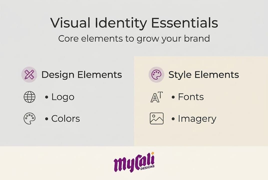
Core elements: The building blocks of visual identity
With the definition in place, it's important to look at what actually makes up a strong and functional visual identity. Each element plays a specific role, and together they create a visual system that's recognizable, scalable, and consistent.
Key components include logo systems (primary, secondary, icons), color palettes (primary, secondary, neutrals with WCAG compliance), typography (1-2 fonts: display and body), imagery styles, icons, patterns, and motion guidelines for digital. Let's look at how these work in practice.
Logo systems
Your logo isn't one file. It's a family of marks. A primary logo for full-size use, a horizontal version for headers, a stacked version for square spaces, and an icon mark for favicons and app icons. Each version serves a different context. Knowing the components of a logo and when to use each one is essential for maintaining a consistent appearance.
| Logo type | Best use case | Recognition impact |
|---|---|---|
| Literal (depicts the product) | Product-based businesses | 56 points higher distinctiveness |
| Abstract (symbolic mark) | Service or tech businesses | Requires more brand exposure |
| Wordmark (text only) | New brands building name recognition | Strong when typography is distinctive |
| Combination mark | Versatile use across formats | Most flexible for SMBs |
Color palette
Color is one of the fastest ways your audience recognizes you. Limiting your palette to 2-3 primary colors and 1-2 neutrals keeps your brand visually clean and memorable. WCAG compliance (Web Content Accessibility Guidelines) ensures your colors are accessible to people with visual impairments, which is both ethical and increasingly expected by customers.

Typography
Typography is often underestimated. Using 1-2 fonts consistently across all materials creates visual harmony. A display font for headlines sets the tone; a body font for paragraphs ensures readability. Mixing too many fonts creates visual noise and signals a lack of professionalism.
Imagery and motion
Your imagery style, whether bright and lifestyle-focused or clean and product-centered, communicates your brand's personality without words. In 2026, motion guidelines for digital (how your logo animates, how transitions feel on your website) are becoming a standard part of any complete visual identity system.
Pro Tip: Create a one-page visual reference sheet with your logo files, hex color codes, font names, and imagery examples. Share it with anyone who creates content for your business. This single step dramatically reduces inconsistency.
Strategic process: How to build visual identity for your business
Now that you know the individual parts, here's how to assemble them into a coherent system for your business. Building a visual identity without a process is like constructing a building without blueprints. You might end up with something standing, but it won't hold up over time.
A proven, step-by-step approach looks like this:
- Define your brand strategy first. Clarify your target audience, your positioning, and your brand personality before touching any design tool. Your visuals should reflect your strategy, not the other way around.
- Conduct a competitor audit. Look at what your competitors are doing visually. Your goal is differentiation. If everyone in your industry uses blue, that might be a reason to consider a different direction.
- Develop scalable assets. Build your logo and graphic elements as SVG vectors. These scale to any size without losing quality, from a business card to a billboard.
- Create usage guidelines. Document clear space rules (how much empty space surrounds your logo), minimum sizes, and do's and don'ts. These guidelines are what keep your identity consistent as your team and vendor list grows.
- Test across contexts. Check your visuals in black and white, at small sizes, on dark and light backgrounds, and for color accessibility. If your logo only works in one context, it's not ready.
For SMBs specifically, prioritizing simplicity with 2-3 colors and 2 fonts, maintaining consistency through short brand guides, and designing for responsive use across web, social, and print is the most practical path forward.
| Step | Tool or method | Key outcome |
|---|---|---|
| Brand strategy | Attribute matrix, audience profiles | Clear positioning |
| Color selection | 60-30-10 rule, WCAG checker | Accessible, balanced palette |
| Asset development | SVG vectors, Figma or Illustrator | Scalable, versatile files |
| Guidelines | One-page or full brand guide | Consistent application |
| Testing | B&W, small-scale, accessibility audit | Reliable performance |
The 60-30-10 rule is a simple framework: 60% of your visual space uses your dominant color, 30% uses a secondary color, and 10% uses an accent. It creates visual balance without requiring design expertise to execute.
Pro Tip: When working with a designer, ask for your final files in SVG and PNG formats. SVG is for digital and scalable use; PNG is for everyday applications. Having both from the start saves significant time and cost later.
You can also explore custom logo creation steps to understand what a professional design process looks like from start to finish.
The business case: Why strong visual identity pays off
Building your identity is an investment. Here's what the research says about results and impact on business growth.
The numbers are clear. Consistent branding yields a 33% revenue increase according to a Marq report, and Frontify users report 367% ROI, a six-month payback period, and $4.22 million in benefits over three years. One rebrand case study showed a 47% increase in leads and doubled conversions. These aren't outliers. They reflect what happens when visual identity is treated as a strategic asset.
Here's why the numbers move like this:
- Recognition reduces friction. When customers instantly recognize your brand, they spend less mental energy deciding whether to trust you. That reduced friction translates directly into faster purchase decisions.
- Consistency lowers customer acquisition cost (CAC). When your visuals are aligned across every channel, your marketing spend works harder. Every touchpoint reinforces the last one, compounding your brand's impact over time.
- Professionalism signals quality. Customers often can't evaluate the quality of your product or service before buying. Your visual identity becomes a proxy for quality. A polished, consistent identity signals that you take your business seriously.
- Inconsistency creates doubt. If your website looks different from your social media, which looks different from your packaging, customers notice. It creates a subtle but real sense of uncertainty that can cost you the sale.
"Brand consistency isn't just a design preference. It's a business performance driver. The businesses that treat their visual identity as a system, not a collection of files, are the ones that see compounding returns."
Maintaining brand consistency on social media is one of the most accessible places to start. Social platforms give you immediate, measurable feedback on what resonates, and consistent visuals make your content instantly recognizable in a crowded feed.
Common pitfalls and 2026 trends in visual identity
To ensure your visual identity continues to drive value, it's vital to avoid common errors and adapt to new trends. The design landscape is shifting, and what worked two years ago may already be working against you.
Common mistakes to avoid:
- Redesigning without preserving your Distinctive Brand Assets (DBAs). A DBA is any visual element that customers strongly associate with your brand, such as a specific color, logo shape, or icon. Redesigning without protecting DBAs risks 15-20% equity loss. This is one of the most expensive mistakes a business can make.
- Chasing trends without a strategy. Trends come and go. If your visual identity is built on what's popular right now rather than what's true to your brand, you'll find yourself redesigning every few years with no continuity.
- Overhauling everything at once. Gradual evolution is almost always safer than a complete overhaul. Customers build familiarity with your visuals over time. Sudden, dramatic changes can confuse your existing audience.
- Ignoring motion and digital guidelines. In 2026, kinetic and motion systems are essential for digital presence. How your brand moves on screen, from logo animations to page transitions, is now part of your visual identity.
Trends shaping visual identity in 2026:
- Literal logos are outperforming abstract marks by 56 points in distinctiveness, making them a stronger choice for new and growing brands.
- Periodic identity refreshes every 18-24 months are replacing the old model of redesigning every five to ten years. This keeps your brand feeling current without abandoning what customers already recognize.
- As AI-generated design becomes more common, brands that invest in distinctive, human-crafted visual systems will stand out more, not less.
Knowing the right brand refresh timing for your business is a strategic decision, not just a creative one.
Pro Tip: Before any redesign, audit your existing brand assets and identify which ones customers actually recognize. Protect those elements. Build your refresh around them rather than replacing them entirely.
Why strategy matters more than aesthetics in visual identity
Here's an opinion we hold firmly, and it sometimes surprises people: a beautiful visual identity built without strategy is a liability, not an asset.
We've seen businesses spend significant budgets on stunning logos and polished websites, only to see little return because the visuals weren't connected to a clear brand strategy. The design looked great in isolation but didn't communicate anything meaningful to the right audience.
The businesses that get the best results from strategic branding are the ones that start with clarity: who they serve, what makes them different, and what feeling they want to create. The visuals come after. When design follows strategy, every element earns its place. When aesthetics lead, you often end up with something that looks good but doesn't work.
For small businesses especially, this approach saves money. Getting the strategy right the first time means fewer costly revisions and less rework down the road. Copying trends or prioritizing visual appeal over alignment is almost always more expensive in the long run.
Take the next step toward a powerful visual identity
If this guide has clarified what visual identity really means and what it takes to build one that works, the next step is putting that knowledge into action.
At Mycali Designs, we help small and medium-sized businesses build visual identities that go beyond aesthetics. From professional branding services to custom website development , our process starts with strategy and ends with a system your business can use consistently across every touchpoint. Whether you're building from scratch or refreshing what you have, we're here to help you create a brand that earns trust and drives growth.
Frequently asked questions
How is visual identity different from brand identity?
Visual identity covers logos, colors, and graphics, while brand identity also includes your business's values, voice, and mission. Think of brand identity as the full picture and visual identity as how that picture looks.
What are the main components of a visual identity?
Core components include your logo, color palettes, typography, imagery style, patterns, icons, and motion guidelines for digital use. These key components work together as a system to create consistent recognition across every platform and format.
How often should I update my business's visual identity?
Experts now recommend reviewing and refreshing your visual identity about every 18-24 months to stay modern and distinctive. Periodic iteration at this cadence helps combat AI-generated design homogeneity and keeps your brand feeling fresh without losing recognition.
Can a visual identity really impact revenue or customer growth?
Yes. Consistent branding can increase revenue by 33%, and rebrand case studies show 47% lead increases and doubled conversions. The return is real when the identity is built and applied strategically.
What is a Distinctive Brand Asset (DBA) and why does it matter?
A DBA is a unique visual element, like a logo shape or signature color, that customers strongly associate with your brand. Losing a DBA in a redesign can reduce brand equity by 15-20%, making it one of the most important things to protect during any refresh.
Recommended
Recent Posts