



Service Website UX Guide for Business Owners: Win More Clients
Service Website UX Guide for Business Owners: Win More Clients

Your single highest-impact move is this: make your primary conversion action visible on every page, on every device, without scrolling. Do that before anything else, and you will see more qualified inquiries within days, not months.
Most service websites fail not because they look bad, but because they behave like brochures. They list services without answering the three questions every visitor asks in the first ten seconds: What do you do? Who do you help? How do I get started? Fix those three answers, and the rest of your UX improvements compound from a much stronger foundation.
Quick-action checklist — assign these today:
- ✅ Rewrite your hero headline to name your service and your customer type (e.g., "Plumbing repairs for Sacramento homeowners")
- ✅ Add a sticky click-to-call or "Book Now" button visible on mobile at all times
- ✅ Reduce your primary contact form to three fields: name, phone/email, and service needed
- ✅ Add a trust strip below the hero (licenses, years in business, review count, certifications)
- ✅ Confirm your phone number is a
tel:link, not plain text - ✅ Run your homepage through Google PageSpeed Insights and fix the top two flagged issues
Timeline: A focused in-house team can complete items 1–5 in one to two weeks. Items requiring development (sticky CTA, form rebuild) take one to three days with a developer or a capable page builder. If you are working with an agency, scope these as a quick-wins sprint before any larger redesign.
Pro Tip: Don't wait for a full redesign to fix your CTA. A sticky "Call Now" bar added to an existing site is one of the fastest, cheapest conversion wins available to a service business.
Why does UX matter so much for service websites?
A service website is not a portfolio. It is your first sales rep, and it works around the clock. When a potential customer lands on your page, they are already in buying mode. Your site's job is to confirm you are the right choice and make it effortless to reach you. If it stumbles on either count, that lead goes to a competitor.
94% of first impressions are driven by website design, not your copy, not your pricing, and not your reviews. Visitors form that judgment in milliseconds.
The stakes are especially high on mobile. Most local-intent searches happen on mobile devices, according to BrightLocal's 2025 consumer survey. A site that is hard to navigate on a phone is not just annoying. It is actively losing you business every day.
Speed compounds the problem. Every additional second of load time erodes trust before a visitor even reads your headline. Industry guidance consistently links a one-second reduction in load time to higher conversion rates, and pages that pass Google's Core Web Vitals benchmarks see less abandonment. For a service business generating leads regularly, that gap is measurable in real revenue.
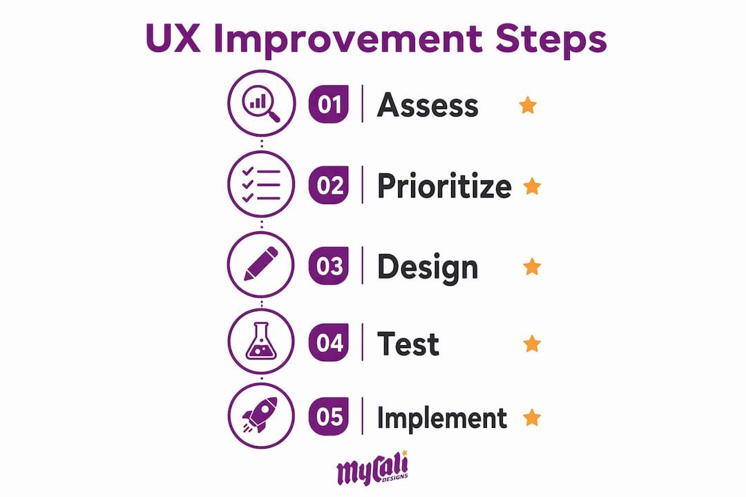
The business outcomes a well-designed service site must deliver are specific: qualified phone calls, booked appointments, and fewer "how does this work?" support questions. Good UX reduces friction at every step toward those outcomes. Poor UX creates friction, and friction kills conversions.
Core usability principles every service site needs
Five principles cover the vast majority of UX problems we see on service websites. None of them require a full redesign to implement.
Clarity: answer the three questions above the fold
Your headline must name what you do and who you serve. "Welcome to our website" is not a headline. "Electrical repairs for Bay Area homeowners and small businesses" is. Pair it with a single, prominent CTA button. One button, one action. Every additional option you add reduces the likelihood a visitor takes any action at all.
Single primary CTA
Pick one conversion goal per page and design toward it. For most service pages, that is a phone call or a booking form. Secondary options (newsletter, social follow) should be visually subordinate. The importance of a clear CTA cannot be overstated: visitors who are uncertain what to do next simply leave.

Visible trust signals
Licenses, certifications, years in business, Google review counts, and association logos belong near the top of the page, not buried in the footer. Trust signals answer the unspoken question every service buyer has: Is this company legitimate?
Mobile-first layout
Design for the smallest screen first, then scale up. Tap targets should be at least 44–56 pixels tall. Phone numbers must use tel:
links. Navigation should collapse cleanly. A sticky bottom bar with a one-tap call or booking button is one of the most effective mobile UX patterns for service businesses.
Accessibility and performance
Accessibility is not optional. The USA.gov accessibility standards and WCAG 2.1 guidelines cover contrast ratios, alt text, keyboard navigation, and form labels. ADA compliance also reduces legal exposure. On performance, prioritize Largest Contentful Paint (LCP) by compressing images to WebP or AVIF format and deferring third-party scripts.
Pro Tip: Use Google's free PageSpeed Insights tool to get a Core Web Vitals score for your homepage and your top service page. Fix LCP first — it has the highest correlation with conversion rate among the three Core Web Vitals metrics.
| Principle | Primary KPI to watch | Quick action |
|---|---|---|
| Clarity (headline + audience) | Bounce rate on homepage | Rewrite hero headline to name service + customer |
| Single primary CTA | CTA click-through rate | Remove secondary CTAs from hero section |
| Trust signals | Time on page, form starts | Add license/review strip below hero |
| Mobile-first layout | Mobile conversion rate | Enable sticky CTA bar; audit tap target sizes |
| Accessibility | ADA compliance score | Add alt text, fix contrast, label all form fields |
| Performance (Core Web Vitals) | LCP, CLS, bounce rate | Convert images to WebP; defer non-critical scripts |
Which pages and flows drive the most conversions?
Every page on a service website has a job. When a page does not know its job, it does nothing. Here is the job-to-be-done for each high-impact page, along with the microcopy patterns that support it.

Homepage: Confirm you are the right provider and make the next step obvious. The hero should answer the three questions (what, who, how) in under five seconds. CTA label: "Get a Free Quote" or "Book a Consult" — not "Learn More" and never "Submit."
Service pages: Convert a visitor who already knows what they need. Lead with the outcome, not the process. "Roof replacement that protects your home for 20+ years" outperforms "We offer residential roofing services." Include a short process section (3–4 steps), proof (reviews, photos), and a CTA repeated at the bottom.
About page: Build human-level trust. Name your team, show real photos, and state your credentials. This page is a high-value conversion asset, not a formality. Visitors who read the About page convert at higher rates than those who skip it.
Contact and booking pages: Remove every field that is not necessary for the first conversation. Three fields work for mobile: name, phone or email, and service type. You can capture project details on the call. A confirmation message after submission should set a clear expectation: "We'll call you within one business day."
Pricing page (if applicable): Anchor expectations, not sticker shock. Ranges ("Projects typically start at $X") reduce the "is this affordable?" anxiety that kills inquiries before they start.
- ✅ Use outcome-oriented CTA labels: "Request a Quote," "Book a Free Consult," "Get My Estimate"
- ✅ Place a CTA at the top and bottom of every service page
- ✅ Keep contact forms to three fields on mobile; expand on desktop if needed
- ✅ Add a
tel:link to every instance of your phone number - ✅ Use a sticky bottom bar on mobile with a one-tap call or booking button
- ✅ Show proof (reviews, photos, credentials) near every CTA
Pro Tip:
On mobile, your phone number should never require a copy-paste. A tel:
link turns the phone number into a one-tap call. Pair it with a sticky bottom bar and you have covered the two most common mobile conversion drop-off points in one change.
How should you organize your site so visitors find services fast?
Site structure is where many service businesses over-engineer or under-invest. The right answer is usually simpler than you think.
A structure covering key pages addresses the needs of most service businesses: home, one page per core service offering, city or service-area pages, about, reviews, blog, and contact. This structure concentrates your SEO authority rather than spreading it thin across dozens of loosely related pages. TTM's 2026 service website guide recommends exactly this footprint for local service businesses targeting city and service-intent queries.
Internal linking should follow buyer intent. Blog posts support service pages. Service pages link to city pages. City pages link back to the primary service page and to contact. This flow mirrors how a buyer moves from awareness ("how much does X cost in [city]?") to decision ("hire this company").
Template structure for a service page
- Headline — service name + customer outcome (e.g., "Commercial HVAC repair that keeps your business running")
- Outcomes section — three to five bullet points on what the customer gets
- Process section — three to four numbered steps showing how you work
- Proof section — two to three reviews, photos, or case results
- CTA — primary conversion action, repeated
- FAQ — three to five questions that reduce pre-sale friction
City pages and FAQ guidance
City pages work only when they contain original content. A page that swaps a city name into a template and changes nothing else will not rank and will not convert. Write one genuine paragraph about the service area, reference local landmarks or regulations if relevant, and add a city-specific review if you have one.
For FAQs, put the most common pre-sale questions directly on the relevant service page. Reserve a site-wide FAQ for questions that span multiple services. Add FAQ schema markup to both so Google can surface your answers in featured snippets. This reduces repetitive inquiries and builds trust before the first call.
What usability testing methods work for service websites?
You do not need a research budget to run useful usability tests. The most effective approach for a service website is lightweight and continuous.
The DHS Usability Testing Kit and Digital.gov's usability resources both provide free templates, scripts, and recruitment guidance that translate directly to small-business service sites.
Three test types and when to use each
-
A small-moderated user test — best for early discovery. Sit with (or video-call) five real or representative users. Ask them to complete two tasks: find your primary service and submit a contact request. Watch where they hesitate. Take notes, do not explain. Run this before any major redesign.
-
A small unmoderated user test — best for validating a specific change. Use a tool like Maze or Lookback to send tasks to ten participants asynchronously. Useful for testing a new form layout or a revised CTA label after you have already made a change.
-
Intercept survey — best for post-launch feedback. A short three-question pop-up ("Did you find what you were looking for? If not, what were you looking for?") on your contact or service page captures real intent data at low cost.
Sample script excerpt for a service homepage test
"Without clicking anything yet, tell me what this business does and who it serves. Now, imagine you need [service type] for your home. Show me what you would do next."
That two-task script surfaces clarity problems (can they identify the service?) and conversion friction (can they find the CTA?) in under ten minutes per participant.
Recruitment and priority matrix
Recruit from your existing customer email list first. Offer a $15–$25 gift card as an incentive. For unmoderated tests, targeted social ads to your service area work well. Aim for participants who match your actual buyer profile, not just anyone willing to click a link.
Priority matrix for UX fixes:
| Fix | Impact | Effort | Priority |
|---|---|---|---|
| Sticky mobile CTA | High | Low | Do first |
| Hero headline rewrite | High | Low | Do first |
| Form field reduction | High | Low | Do first |
| Trust strip addition | Medium | Low | Do second |
| Service page restructure | High | Medium | Do second |
| City page creation | Medium | High | Do third |
| Full redesign | High | Very High | Validate first |
How do you measure whether your UX changes are working?
Measurement is where most service businesses drop the ball. They make changes and then check Google Analytics a month later without knowing what to look for. A small, focused KPI set prevents that.
Primary KPIs to track:
- Phone call volume (tracked via call tracking software like CallRail or a Google forwarding number)
- Booking or form conversion rate (form submissions divided by form page visits)
- CTA click-through rate (clicks on your primary CTA button, tracked as a Google Analytics event)
- Form start vs. form completion rate (identifies drop-off inside the form)
- Largest Contentful Paint (LCP) (target: under 2.5 seconds)
- Bounce rate on service pages (a high bounce on a service page usually signals a mismatch between the ad or search result and the page content)
- Task success rate (from usability tests: percentage of participants who completed the target task)
Analytics setup checklist
- ✅ Set up Google Analytics 4 with conversion events for form submissions and phone clicks
- ✅ Tag your primary CTA button as a GA4 event ("cta_click")
- ✅ Track form starts as a separate event from form completions to find drop-off
- ✅ Connect Google Search Console to identify which queries drive traffic to service pages
- ✅ Set up a Google forwarding number or CallRail to attribute calls to specific landing pages
- ✅ Add a goal in GA4 for each primary conversion action (call, form, booking)
A/B testing guidance
Run one test at a time. Test your highest-traffic page first, which is almost always your homepage. A meaningful test needs enough traffic to reach statistical significance. As a practical rule, wait until each variant has at least 100 conversions before drawing conclusions. Common pitfalls: ending a test too early, testing two changes simultaneously, and measuring the wrong metric (page views instead of conversions).
Good first A/B tests for service sites: CTA label ("Get a Free Quote" vs. "Book a Consult"), hero headline variant, form field count (three fields vs. five fields), and trust strip placement (above vs. below the hero). For deeper guidance on design's role in conversions, the connection between visual choices and measurable outcomes is well documented.
What does a realistic UX improvement roadmap look like?
Phased implementation prevents the two most common mistakes: doing everything at once (expensive, disruptive) and doing nothing until the budget is perfect (indefinitely delayed). Here is a three-phase roadmap you can follow or hand directly to your web team.
| Phase | Example tasks | Timeline | DIY cost | Agency cost |
|---|---|---|---|---|
| Quick wins | Sticky CTA, hero headline, form reduction, trust strip, tel:
links, PageSpeed fixes |
1–3 weeks | — | — |
| Medium-term | Service page restructure, city pages (2–3), About page rewrite, GA4 events setup, A/B test #1 | 1–3 weeks | — | — |
| Strategic | Full redesign or rebuild, ADA compliance audit, advanced analytics, ongoing testing cadence | 1–3 weeks | — | — |
Scoping checklist for an agency brief:
- ✅ Define your single primary conversion goal (call, form, booking)
- ✅ List your top three to five services and the cities you serve
- ✅ Confirm access to existing Google Analytics and Search Console accounts
- ✅ Gather proof assets: photos, reviews, licenses, certifications
- ✅ Identify who will approve copy and design (one decision-maker, not a committee)
- ✅ State your timeline and hard deadlines
Validate quick wins before committing to a full redesign. If a sticky CTA and a headline rewrite lift your call volume by 20%, you have evidence that the site's core structure is sound and a full rebuild may not be necessary. Spend the redesign budget on content and city pages instead. For a step-by-step implementation reference, the service website conversion guide covers tactical depth on each phase.
How Mycalidesigns applies these principles in client work
The framework in this guide is not theoretical. It is the same process Mycalidesigns uses across client engagements, from contractors and restaurants to professional service firms.
Project checklist for a typical engagement
- Discovery: Identify primary conversion goal, target audience, service area, and existing analytics data
- Content capture: Gather proof assets (photos, reviews, credentials, team bios)
- Information architecture: Map pages to buyer intent; confirm site structure matches the seven-page model or a justified variation
- Build: Develop mobile-first, with sticky CTA, trust strip, and Core Web Vitals targets built in from the start
- QA:
Test on real devices (not just browser emulators), verify all forms and confirmations, check
tel:links, and confirm phone tracking is live - Analytics: Set up GA4 events, conversion goals, and Search Console before launch
Before/after example
A service business running a five-field desktop-first contact form with a static CTA button saw a meaningful drop in mobile form completions. After reducing the form to three fields and adding a sticky "Call Now" bar for mobile visitors, mobile conversions improved substantially. This pattern aligns with the research: sticky CTAs consistently lift conversions for mobile users by a significant margin when the primary action is persistent and uses a tel:
link.
Pro Tip: When handing this roadmap to an agency, send the scoping checklist above with your brief. It cuts discovery time significantly and prevents scope creep by anchoring the engagement to a single, agreed conversion goal from day one.
Key Takeaways
A service website's single most important job is to answer what you do, who you help, and how to reach you — then get out of the way.
| Point | Details |
|---|---|
| Mobile-first CTA is the top priority | A sticky, one-tap CTA on mobile can significantly lift conversions versus a static placement. |
| Three-field forms outperform longer ones | Reduce contact forms to name, phone/email, and service type to maximize mobile completions. |
| Seven-page structure concentrates authority | Home, per-service pages, city pages, about, reviews, blog, and contact covers most service businesses. |
| Measure calls, form rate, and LCP first | Track phone calls, form conversion rate, and Largest Contentful Paint before any other metrics. |
| Mycalidesigns applies this framework for clients | Mycalidesigns builds service websites using this same phased approach, from discovery through analytics setup. |
The trade-offs no one talks about in UX for service sites
The conventional wisdom on service website UX tends toward maximalism: add more trust signals, more pages, more content, more features. In practice, the businesses that see the fastest results do the opposite. They cut. They simplify. They pick one conversion action and remove everything that competes with it.
The real trade-off is not between a full redesign and targeted fixes. It is between the desire to look comprehensive and the discipline to be clear. A service website that tries to explain everything it offers, showcase every credential, and answer every possible question before the visitor has even decided they are interested will lose that visitor. A site that says "here is what we do, here is who we help, here is how to reach us" and then stops talking will convert.
When should you choose a full redesign over targeted fixes? When the site's structure is fundamentally misaligned with your current services, when it is not mobile-responsive at all, or when the brand has changed significantly since the last build. In every other case, targeted fixes to the homepage, service pages, and contact flow will deliver a better return on the same budget. The SMB website design guide makes this case clearly: launch lean, validate, then invest in depth.
The other trade-off worth naming is speed versus polish. A site that loads in 1.5 seconds and looks clean will outperform a visually stunning site that loads in 4 seconds, every time, for every service business. Performance is not a technical nicety. It is a conversion variable.
Mycalidesigns helps you build a service website that actually converts
If this guide has clarified what needs to change on your site, the next question is who does the work. Mycalidesigns offers website design, UX-focused rebuilds, ADA compliance audits, analytics setup, and conversion-focused service page development for small and medium-sized businesses across the United States.
A typical engagement starts with a scoped discovery call where we identify your primary conversion goal, audit your current site against the principles in this guide, and recommend a phased plan. You get a clear deliverable list, a realistic timeline, and a single point of contact throughout. No guessing about what is included, no surprise scope expansions.
Whether you need a quick-wins sprint (sticky CTA, form reduction, trust strip) or a full rebuild with city pages and analytics, we scope to your actual situation. Explore our agency services overview or review our website design service details to see what a scoped engagement looks like. Ready to get started? Request a discovery call and we will review your site and send you a prioritized recommendation within two business days.
Useful sources and further reading
The sources below support the claims in this guide and offer templates, scripts, and deeper research for teams that want to go further.
-
Digital.gov — Usability: The U.S. government's central resource for usability standards, testing templates, and research methods. Directly applicable to service site testing and accessibility planning.
-
DHS Usability Testing Kit: Free, downloadable test scripts, screener templates, and facilitation guides from the Department of Homeland Security's customer experience team. Practical for running moderated tests on a service homepage or booking flow.
-
USA.gov — Designing for people with disabilities: Practical guidance on WCAG 2.1 compliance, accessible form design, and contrast standards — relevant for ADA compliance work on service sites.
-
USA.gov — Accessibility testing: Covers how to run accessibility tests and what tools to use, including screen reader testing and automated checkers.
-
TTM — Service Business Website Design Guide (2026): Practitioner-level guide covering mobile CTA patterns, seven-page site structure, Core Web Vitals, and city page strategy. Source for several statistics cited in this article.
-
CodeDesign.ai — Service Business Website Blueprint (2026): Covers the three-question clarity rule, microcopy patterns, and trust signal placement. Source for the 94% first-impressions statistic.
-
Rasmussen University — UX Guidelines for Designers: Accessible overview of core UX principles including hierarchy, accessibility, and usability heuristics.
-
ASU Brand Guide — UX Design Standards: Institutional UX standards covering navigation, content hierarchy, and mobile usability — useful as a benchmark for service site structure.
-
Mycalidesigns — Service industry marketing tips: Practical marketing and UX strategies for service businesses, with examples from real client work.
-
Mycalidesigns — Build a service website that converts: Step-by-step implementation guide covering page structure, CTA placement, and conversion tracking setup.
-
Mycalidesigns — Digital branding strategies: Covers how trust signals, visual identity, and brand consistency affect conversion rates on service websites.
Recommended
Recent Posts