
Product Catalog Design Process: A Practical SMB Guide
Product Catalog Design Process: A Practical SMB Guide

TL;DR:
- Effective product catalog design begins with organizing data and understanding customer shopping behavior. A well-structured catalog prioritizes clear architecture over visual aesthetics to drive engagement and sales.
The product catalog design process is a structured workflow that transforms raw product data into a visually engaging, sales-driving publication. Done right, it gives business owners and marketing managers a repeatable system for producing catalogs that build brand trust and move customers toward purchase. Done wrong, it produces expensive reprints, missed deadlines, and layouts that confuse rather than convert. This guide walks through every phase, from data preparation to final proofing, so you can build a catalog that works the first time.
What does the product catalog design process actually require?

The product catalog design process is defined as a sequential workflow covering data consolidation, audience-centric structure, visual layout, and production delivery. The industry term for this end-to-end approach is catalog production workflow , and understanding both terms helps you communicate clearly with designers, printers, and vendors.
Strategic planning must come before any design software opens. Skipping this phase produces chaotic final products that require expensive rework. The goal of the workflow is threefold: drive product discovery, support conversion, and represent your brand consistently across every page.
Two principles separate effective catalogs from mediocre ones. First, data readiness before design prevents costly layout revisions when product information changes mid-project. Second, catalog architecture, not surface aesthetics, is what drives customer engagement and purchase decisions.
What prerequisites and tools do you need before starting?
Most catalog projects fail before a single page gets designed. The cause is almost always the same: teams open design software before their product data is clean, complete, and consistent.
Building your master data foundation
Start with a master spreadsheet that captures every SKU, product name, price, description, unit of measure, and image file name. Consistent SKUs and image names aligned to product cards eliminate layout errors and speed up revisions significantly. Run a content audit before you touch any design tool. Check for inconsistent naming conventions, missing specs, and conflicting units across product lines.
Pro Tip: Lock your product data before briefing a designer. Any change to pricing or descriptions after layout begins can cost hours of revision time.
Choosing your format and tools
Your format choice shapes every design decision that follows. Print and digital catalogs share some requirements but diverge sharply on technical specs.
| Requirement | Print catalog | Digital catalog |
|---|---|---|
| Bleed area | 0.125 inches beyond trim | Not applicable |
| Inner margins | 0.5 inch for perfect bound | Flexible, screen-dependent |
| File delivery | Print-ready PDF | Interactive PDF or web format |
| Updates | Reprint required | Real-time via product feed |
| CTAs | Phone, URL, QR code | Clickable buttons, tracked links |
For digital catalogs, automated product feed workflows connect your inventory directly to design templates, eliminating manual re-exports and keeping pricing current without rebuilding pages. For print, supplying print-ready PDF files rather than native source files prevents font and linking issues during production.
Core tools you will need include a spreadsheet application for data management, professional layout software for page design, and a cloud-based proofing platform for review cycles. The specific tools matter less than the discipline of using them in the right sequence.
How do you structure a catalog for maximum customer engagement?
Catalog architecture drives results more than visual polish. This is the insight most business owners miss. They blame low conversion on photography or color choices when the real problem is that products are grouped by internal inventory logic rather than by how customers actually shop.
Organizing products around customer behavior
Customers browse by need, occasion, or problem they want to solve. They do not browse by your warehouse numbering system. Group products the way a knowledgeable salesperson would present them: by use case, by customer type, or by the decision a shopper is trying to make.
Here is a practical grouping checklist:
- Map your top three customer types and list what each one comes to you to solve.
- Group products into clusters that match each customer's mental model, not your internal categories.
- Place your highest-value or most-recognized products at the front and on right-hand pages, where eye tracking research confirms readers look first.
- Break long product runs with lifestyle imagery or editorial content to prevent visual fatigue.
- Reserve back pages for accessories, add-ons, or complementary items that support the primary purchase.
Using layout to guide the eye
The Bento Box layout places your hero product in the largest block on the page, surrounded by smaller supporting details and secondary products. Experts confirm this approach prevents monotony and keeps the reader's eye moving in a deliberate path. Uniform grid layouts, where every product gets the same box size, train readers to skim rather than engage.
Varied modular grids outperform uniform columns for visual interest and navigation. Alternate between full-width hero spreads, two-column product grids, and single-product feature pages to create rhythm across the catalog.
Pro Tip: Place your three best-selling products on the outer edges of spreads. Readers' eyes naturally land there first, making those positions your highest-value real estate.
The visual branding process behind layout choices, including color hierarchy and typographic scale, directly affects how confidently customers read and trust your catalog.
What are the step-by-step execution phases in the catalog design workflow?
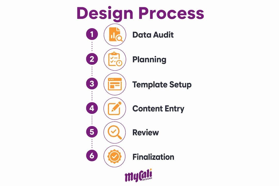
A reliable catalog design workflow follows six distinct phases. Skipping or compressing any phase creates problems that surface at the worst possible moment, usually during final proofing or after print delivery.
Phase 1: Data audit and sign-off. Freeze all product data before design begins. Every SKU, price, and description must be approved by the relevant stakeholders. Changes after layout begins multiply revision time.
Phase 2: Format and specification planning. Decide on page size, binding method, and distribution channel. For print, confirm bleed settings of 0.125 inches and inner margins of at least 0.5 inches for perfect-bound books. For digital, define interactive elements and tracking parameters upfront.
Phase 3: Master page and template creation. Build consistent master pages that carry your grid, margins, header and footer zones, and brand color fields. Create a reusable product card template that accommodates your longest product name and most complex spec list. Limiting typography to 2–3 fonts improves readability and maintains visual hierarchy across every page.
Phase 4: Content population. Place product photography, copy, pricing, and technical specifications into templates. Maintain consistent image treatment: same background, same lighting angle, same crop ratio across all product shots. Inconsistent photography is one of the fastest ways to make a professional layout look amateur.
Phase 5: Digital enhancements (for digital catalogs). Add interactive CTAs with tracked URLs so you can measure which products generate the most clicks. Connecting product feeds directly to templates enables real-time updates without rebuilding pages. Place CTAs where the reader's eye naturally rests after reviewing a product, typically the lower right of a product card.
Phase 6: Proofing and production delivery. Conduct at least two rounds of proofing: one for content accuracy and one for design consistency. For print, deliver a print-ready PDF. For digital, test all interactive elements across devices before publishing.
- ✓ Data frozen and signed off before layout begins
- ✓ Master pages built before content population
- ✓ Typography limited to 2–3 font families
- ✓ Print specs confirmed: 0.125-inch bleed, 0.5-inch inner margins
- ✓ Digital CTAs tracked and tested before launch
- ✓ Two proofing rounds completed before delivery
Understanding how design drives conversions at each phase helps you prioritize where to invest time and budget for the greatest return.
How do you fix common catalog design mistakes?
The most common catalog mistakes are structural, not visual. Fixing them requires looking at data, not just aesthetics.
- Starting design before data is ready. This is the single most expensive mistake in catalog production. Every pricing change or product addition after layout begins costs revision time that compounds across every affected page.
- Grouping products by internal logic. Organizing by SKU range or department makes sense for your warehouse. It makes no sense to a customer browsing for a solution.
- Ignoring session and click-through data. Analytics-driven iteration outperforms periodic redesigns. Small structural changes guided by real behavior data produce better results than full catalog overhauls based on gut feel.
- Monotonous layouts. Repeating the same grid across 40 pages trains readers to stop seeing the content. Vary your layout every 4–6 spreads.
- Weak or missing CTAs. A catalog without a clear next step is a brochure. Every product section needs a measurable call to action, whether that is a URL, a QR code, or a phone number. Effective CTAs placed at natural reading rest points consistently outperform CTAs buried in footers.
"The most common misconception is that poor design causes low conversion. In reality, catalog structure and product grouping drive results far more than aesthetics." — Publitas catalog design experts
Pro Tip: Run a five-second test on your cover and key spreads. If a viewer cannot identify your top product category and brand within five seconds, your layout hierarchy needs work before anything else.
SMB owners often attribute poor catalog performance to design quality when the real issue is flawed product grouping. Fixing the structure first, then refining the visuals, is the correct sequence.
Key takeaways
A successful catalog design workflow starts with frozen product data, builds around customer browsing behavior, and improves through analytics rather than guesswork.
| Point | Details |
|---|---|
| Data first, always | Freeze all SKUs, prices, and descriptions before opening any design software. |
| Structure over aesthetics | Catalog architecture and product grouping drive conversion more than visual polish. |
| Print specs matter | Use 0.125-inch bleeds and 0.5-inch inner margins for professional print output. |
| Vary your layouts | Alternate grid formats every 4–6 spreads to maintain reader engagement. |
| Iterate with data | Use click-through and session data to guide structural improvements over time. |
What I've learned from watching SMBs get catalog design backwards
Most business owners I work with come to catalog projects with the same instinct: get it looking good first, then figure out the details. That instinct costs them time and money every single time.
The catalogs that actually sell products share one trait. They were built on clean, complete data before a single layout decision was made. The visual work, the photography, the color choices, those matter. But they are the last 30% of the job, not the first.
I have also seen a real shift in how the best catalogs are built now. Modular grid systems and automated product feeds are no longer just for large enterprises. SMBs can connect inventory data directly to digital templates and publish updates in hours rather than weeks. That changes the economics of catalog production completely.
The caution I always share: do not let the digital tools make you sloppy about structure. Automation speeds up production. It does not fix a catalog organized around your internal categories instead of your customer's needs. Get the architecture right first. Then let the tools do the heavy lifting.
— Cesar
How Mycalidesigns supports your catalog design needs
Producing a catalog that looks professional and performs well requires more than good software. It requires a design partner who understands both the structural logic and the brand standards that make catalogs work.
Mycalidesigns offers print and digital design services built for SMBs that need catalogs, lookbooks, and marketing materials that represent their brand accurately and drive real results. From brand identity development to full catalog production, the team handles the workflow so you can focus on your business. If you are ready to build a catalog that works as hard as you do, reach out to Mycalidesigns for a consultation.
FAQ
What is the first step in the product catalog design process?
The first step is completing a full data audit: every SKU, price, description, and image file must be finalized and approved before any layout work begins. Starting design before data is ready is the leading cause of costly revisions.
How many fonts should a product catalog use?
A product catalog should use 2–3 font families maximum. Limiting typography improves readability and maintains a clear visual hierarchy between product names, specifications, and brand content.
What bleed size is required for print catalogs?
Professional print standards require a bleed of at least 0.125 inches beyond the final trim size. This prevents white borders from appearing when pages are cut during production.
How do digital catalogs differ from print in the design workflow?
Digital catalogs support interactive CTAs, tracked links, and automated product feed connections that update pricing in real time. Print catalogs require fixed specs like bleed areas and inner margins, and any content change requires a reprint.
Why do product catalogs fail to convert customers?
Poor conversion most often results from flawed catalog structure and product grouping, not from visual design quality. Organizing products around customer browsing behavior rather than internal inventory logic is the most effective fix.
Recommended
Recent Posts