


What Is Responsive Design? A 2026 Guide for Builders
What Is Responsive Design? A 2026 Guide for Builders

TL;DR:
- Responsive web design creates one adaptable website for all screen sizes, improving performance and user experience. It uses fluid grids, flexible images, and media or container queries to ensure consistency across devices and layout contexts. Adopting a mobile-first approach and managing designs systematically significantly benefits business reach, SEO, and maintenance.
Responsive design is defined as the practice of building a single website that automatically adjusts its layout, images, and content to fit any screen size, from a smartphone to a wide desktop monitor. The industry term is responsive web design , coined by Ethan Marcotte in 2010, and it remains the foundational standard for modern web development. Mobile devices now account for 63% of web traffic , and 83% of users expect a smooth cross-device experience. Those two numbers alone explain why understanding responsive design is no longer optional for designers, developers, or business owners.
What is responsive design, and how does it work?
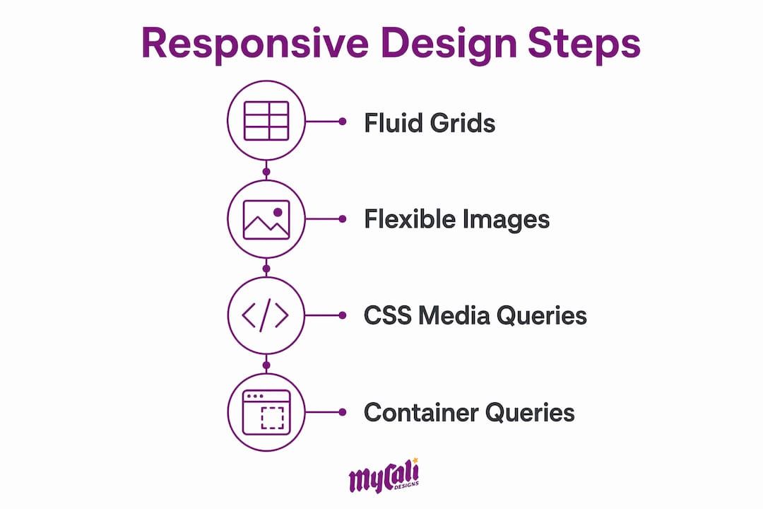
Responsive web design works by combining three core techniques: fluid grids, flexible images, and CSS media queries. Each technique plays a specific role, and together they create layouts that adapt without requiring separate mobile and desktop codebases.

Fluid grids
replace fixed pixel columns with relative units like percentages, em
, or the CSS fr
unit. A column set to 50%
always takes up half its container, regardless of screen width. This is the opposite of a fixed layout, where a 600px
column overflows on a 375px phone screen.
Flexible images
scale within their containers using a simple CSS rule: max-width: 100%
. This prevents images from breaking layouts on smaller screens while still displaying at full size on larger ones.
CSS media queries are the conditional logic layer. They apply different style rules based on viewport characteristics like width, height, or orientation. A media query might say: "If the screen is narrower than 768px, stack these columns vertically." That single instruction handles thousands of device combinations.
A newer technique worth knowing is container queries . Where media queries respond to the viewport size, container queries allow components to adapt to their parent element's size independently. This is a significant shift. A card component inside a narrow sidebar behaves differently than the same card in a wide main column, even on the same page. Container queries make that kind of component-level adaptability possible without writing separate overrides.
| Technique | Responds to | Best used for |
|---|---|---|
| CSS media queries | Viewport width or height | Page-level layout changes |
| Container queries | Parent element size | Component-level adaptability |
Pro Tip:
Never build a layout using fixed pixel widths for columns. Switch to percentage-based or fr
unit grids from the start. Retrofitting fluid grids into a fixed layout costs far more time than building them correctly the first time.
Why is a mobile-first approach the right starting point?
Mobile-first design means you write your base CSS for the smallest screen first, then use media queries to progressively add complexity for larger screens. This is the opposite of the older "desktop-first" approach, where developers would shrink a large layout down to fit a phone.
Mobile-first design produces faster load times, cleaner code, and better user experience. The reason is simple: when you start small, you are forced to prioritize what actually matters. Navigation, core content, and primary calls to action get the spotlight. Decorative elements that slow down performance get cut or deferred.
The performance benefit is real. Mobile networks are slower than broadband. A site built mobile-first loads its critical content first and adds enhancements only when the device can handle them. A site built desktop-first often ships heavy assets to phones that never needed them.
Search engines also reward this approach. Google uses mobile-first indexing, meaning it crawls and ranks your site based on its mobile version. A site that looks great on desktop but breaks on a phone will rank lower, regardless of its content quality.
Here are the core practices that define a solid mobile-first build:
- Write base styles for small screens with no media queries first
- Add
min-widthbreakpoints to enhance layouts for larger screens - Use system fonts or load only the font weights you actually need
- Compress and serve images in modern formats like WebP
- Test on real devices, not just browser resize tools
- Keep navigation simple and thumb-friendly at the base level
Pro Tip: Treat your mobile layout as the real design. If a feature or section does not work on a 375px screen, question whether it belongs in the design at all.
How does responsive design improve user experience and business outcomes?
The business case for responsive design is direct. Businesses can lose up to 90% of potential customers due to a poor mobile experience. That is not a UX problem. That is a revenue problem.
57% of consumers say they are unlikely to recommend a business with a poor mobile site. Word of mouth is one of the most reliable growth channels for small and mid-size businesses. A broken mobile layout quietly kills it.
Responsive design also improves SEO and accessibility, two factors that compound over time. Better accessibility means more users can engage with your content. Better SEO means more users find it in the first place. For businesses investing in web design for growth , these two factors directly affect return on investment.
The advantages of responsive design for businesses include:
- Lower bounce rates. Users who land on a site that works on their device stay longer.
- Wider audience reach. With 63% of traffic coming from mobile, a non-responsive site is invisible to most visitors.
- Stronger brand trust. A site that looks professional on every device signals that the business is credible and attentive to detail.
- Single codebase maintenance. One site to update, test, and manage instead of separate mobile and desktop versions.
- Core Web Vitals alignment. Google's ranking signals reward fast, stable, and accessible pages, all of which responsive design supports.
- Higher conversion rates. A consistent experience across devices removes friction from the path to purchase or inquiry.
For businesses with local audiences, like restaurants or service providers, responsive design for local businesses is especially critical. Most local searches happen on phones, and users make decisions within seconds of landing on a page.
What are the best practices and common pitfalls in responsive design?
The most common mistake in responsive design is treating it as a series of one-off fixes rather than a system-level concern. Fixed pixel layouts and ignoring component responsiveness lead to maintenance difficulties and inconsistent user experiences. You end up with a patchwork of overrides that no one fully understands six months later.
Successful responsive design manages behaviors like grid scaling and typography globally within design systems, not page by page. When your type scale, spacing, and grid are defined once and applied everywhere, changes are predictable and fast.
Optimizing images and using fluid typography functions like clamp()
are two of the highest-impact technical improvements you can make. The clamp()
function sets a minimum, preferred, and maximum font size in a single line of CSS. Typography scales fluidly between breakpoints without a single media query.
Here are the most common pitfalls and how to avoid them:
- Using fixed pixel widths for layout columns.
Replace with percentages or
frunits. - Setting breakpoints based on popular device sizes. Set breakpoints where your content breaks, not where Apple or Samsung releases a new phone.
- Ignoring component-level responsiveness. Use container queries for components that appear in multiple layout contexts.
- Skipping real-device testing. Browser DevTools resize mode does not replicate real touch behavior, font rendering, or performance.
- Loading full-size images on mobile.
Use the
srcsetattribute or a CDN with image resizing to serve appropriately sized images. - Treating responsiveness as a final step. Build it into every design decision from the first wireframe.
Pro Tip:
Use clamp()
for your heading sizes. A single line like font-size: clamp(1.25rem, 4vw, 2.5rem)
gives you fluid typography across all screen sizes without writing three separate media query overrides.
Key takeaways
Responsive web design is the non-negotiable foundation of any site that needs to perform across devices, retain users, and rank in search.
| Point | Details |
|---|---|
| Core techniques | Fluid grids, flexible images, and CSS media queries form the foundation of every responsive layout. |
| Container queries | Container queries extend responsiveness to the component level, solving problems media queries cannot. |
| Mobile-first approach | Starting with mobile styles first produces faster load times, cleaner code, and better search rankings. |
| Business impact | Poor mobile experience can cost businesses up to 90% of potential customers and damage word-of-mouth. |
| Design system thinking | Managing responsive behaviors globally in a design system prevents maintenance problems and inconsistency. |
Why I think most teams still get responsive design wrong
After working on web projects across industries, the pattern I see most often is this: a team builds a desktop layout, then spends the last week of a project trying to make it work on phones. The result is always the same. Overrides stacked on overrides, breakpoints that feel arbitrary, and a mobile experience that technically works but never feels right.
The shift that actually changes outcomes is treating responsive design as a design system decision, not a CSS task. When your spacing scale, type scale, and grid are defined globally, every new page or component inherits the right behavior automatically. You stop fighting the layout and start building on top of it.
Container queries are the most underused tool in this space right now. Most developers know about media queries and stop there. But a card component that lives in a sidebar, a main column, and a modal all at once needs to respond to its container, not the viewport. Once you start thinking at the component level, your layouts become genuinely modular.
My honest advice: if your site was built more than three years ago without a mobile-first foundation, do not patch it. Rebuild it with a proper design system. The short-term cost is real. The long-term maintenance savings and user experience improvement are worth it every time.
— Cesar
Mycalidesigns builds responsive sites that work everywhere
At Mycalidesigns, we build websites that look right and perform well on every device your customers use. Every project starts with a mobile-first foundation and a design system that keeps your site consistent and easy to maintain as it grows. Whether you need a full custom website development project or a complete overhaul of an existing site, we bring the same structured approach: clear goals, responsive architecture, and a final product that builds trust with your audience from the first visit. Our website and SEO services are built around the same principles covered in this article.
FAQ
What is the responsive web design definition?
Responsive web design is the practice of building a single website that adapts its layout and content to any screen size using fluid grids, flexible images, and CSS media queries.
How does responsive design differ from adaptive design?
Responsive design uses fluid layouts that scale continuously, while adaptive design uses fixed layouts that snap to predefined breakpoints. Responsive design is more flexible and requires less maintenance.
What are the main advantages of responsive design for businesses?
The main advantages include lower bounce rates, wider mobile audience reach, stronger brand trust, better SEO performance, and a single codebase that is easier to maintain.
What are container queries and why do they matter?
Container queries allow a component to respond to the size of its parent element rather than the viewport. This makes components truly reusable across different layout contexts without extra overrides.
Why choose responsive design over a separate mobile site?
A single responsive site is easier to maintain, avoids duplicate content issues that hurt SEO, and delivers a consistent experience across all devices without managing two separate codebases.
Recommended
Recent Posts