Services fournis

From our first meeting, the weight of the Harlan Family legacy in Woodland, CA, agriculture was immediately palpable. It was a clear mandate that the project needed to preserve this rich, multi-generational history. Their primary creative needs focused on two elements:
- Developing a new brand that truly represented the family behind the name.
- Incorporating a tangible, historic element as a visible reminder of their deep, farming roots.
à propos de notre client
Situé à :
Client depuis :
Catégorie d'activité :
Notre approche
Réunion de lancement
Nous souhaitons en savoir plus sur vous et votre entreprise, qui sont vos clients, quels types de designs vous appréciez.
Conception préliminaire
À ce stade, nous explorons les différentes idées issues de nos processus de développement. Après avoir affiné nos notes et nos échantillons de conception, nous présentons trois concepts initiaux.
Recueillez vos avis
Nous souhaitons vous impliquer au maximum dans le processus. Ces étapes sont importantes afin de recueillir un maximum d'informations pour finaliser le logo qui représentera votre entreprise.

We began by focusing on the business's origin: the alfalfa crop that made Harlan Farms known for its feed cubes. Comprehensive research into the features and structure of this foundational product informed our initial direction.
Next, we explored how to authentically integrate the family legacy. Understanding the Harlan family's rich history and values allowed us to develop design elements that are subtle yet deeply meaningful, reflecting their generational commitment.
La révélation
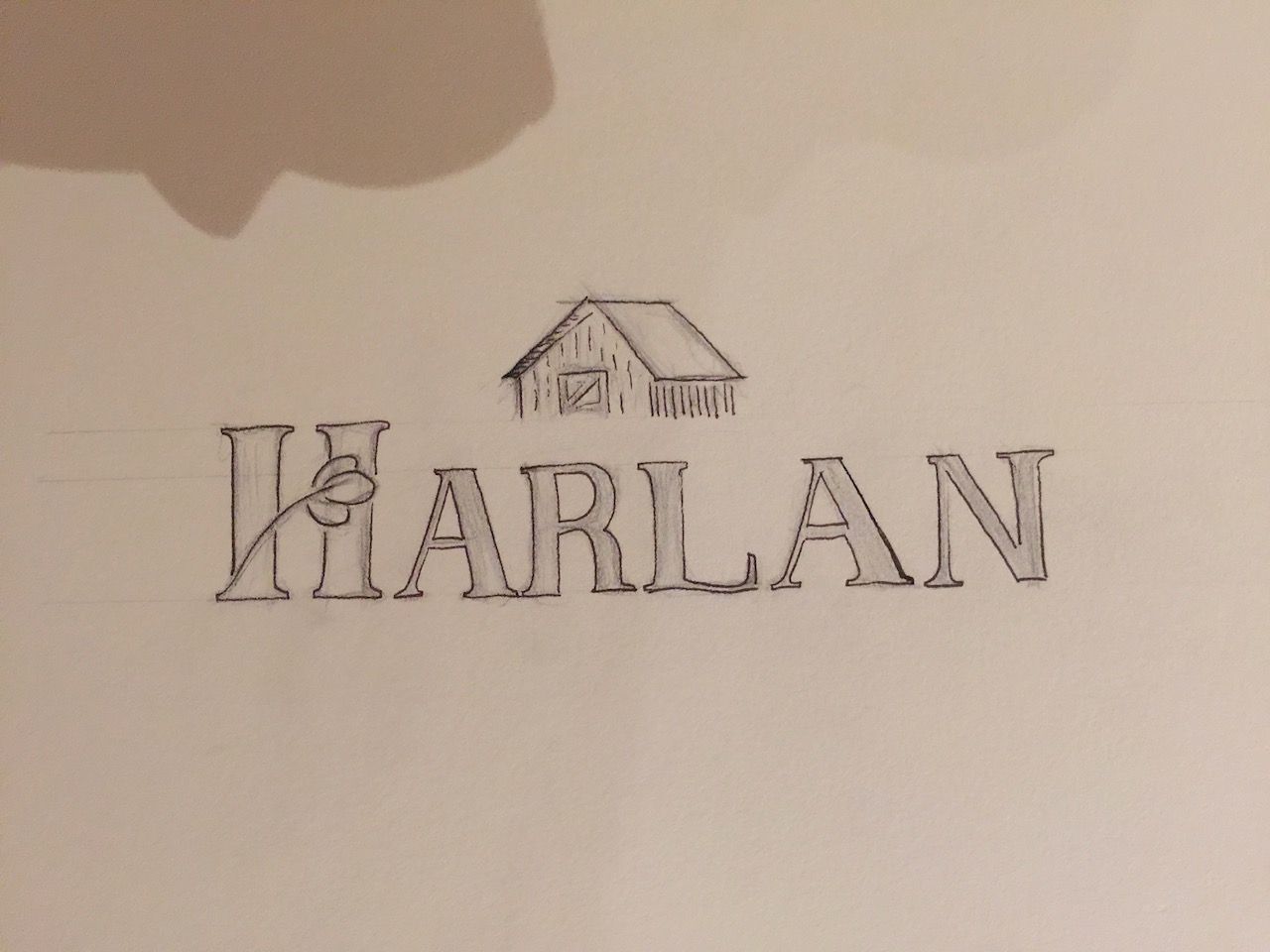
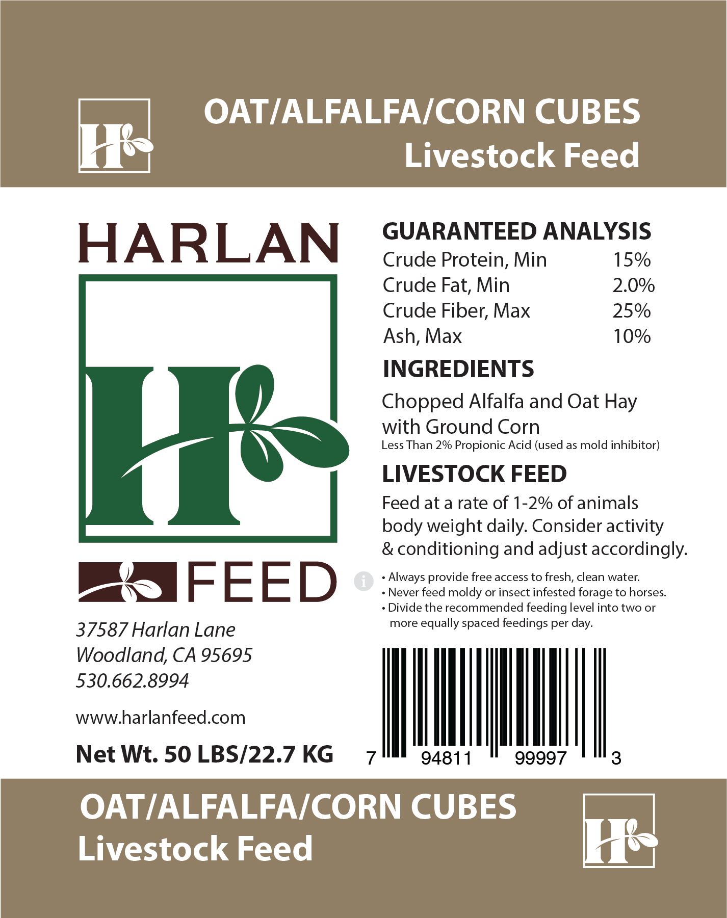
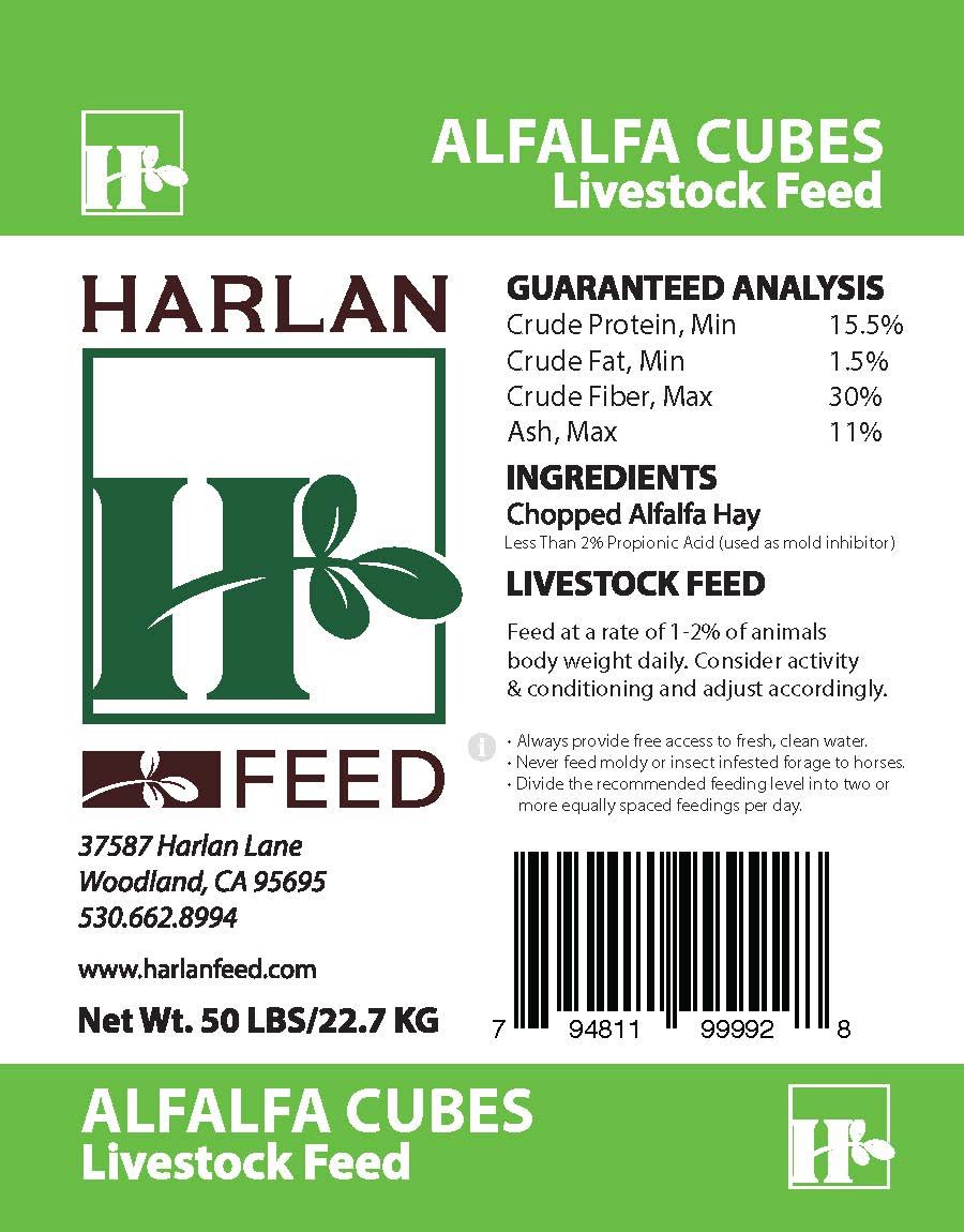
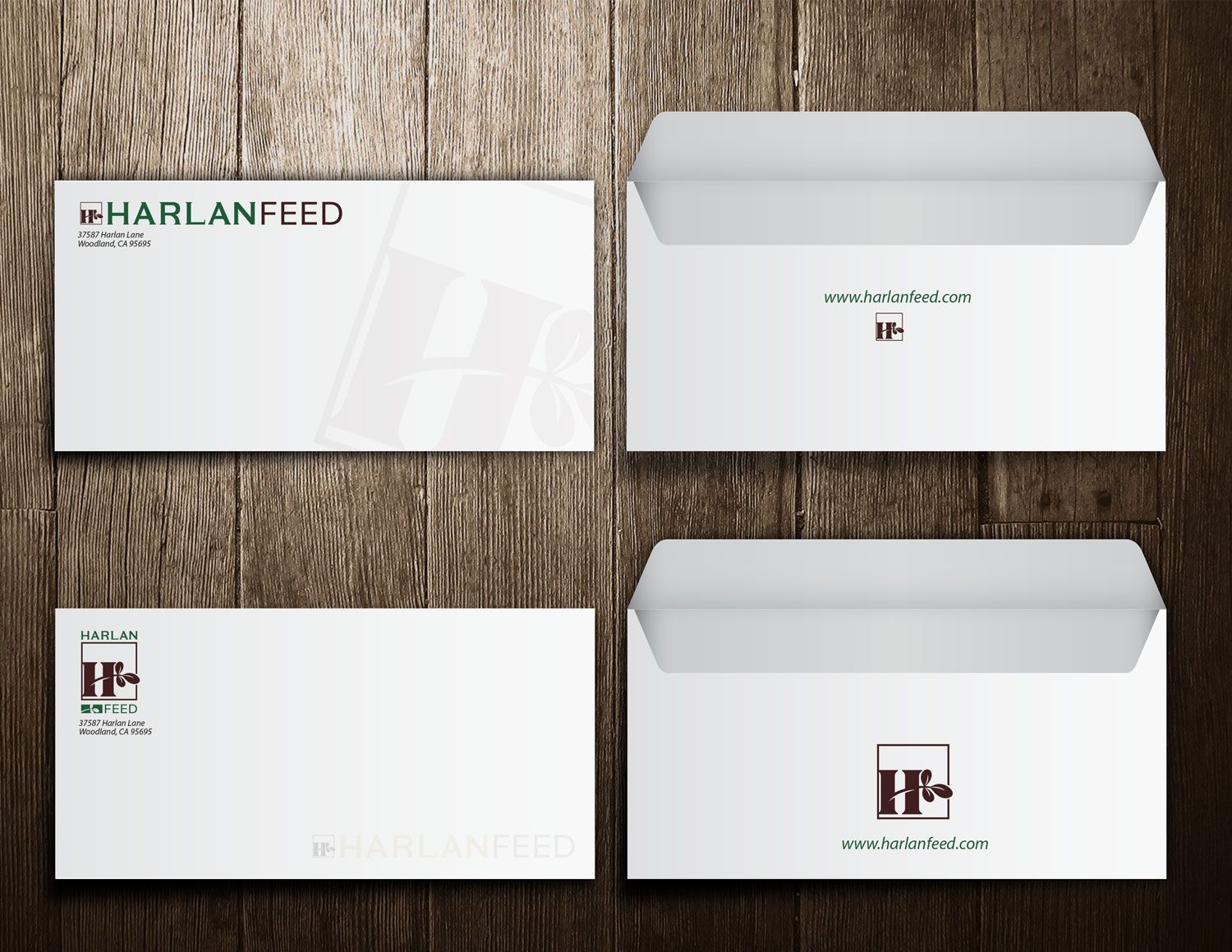
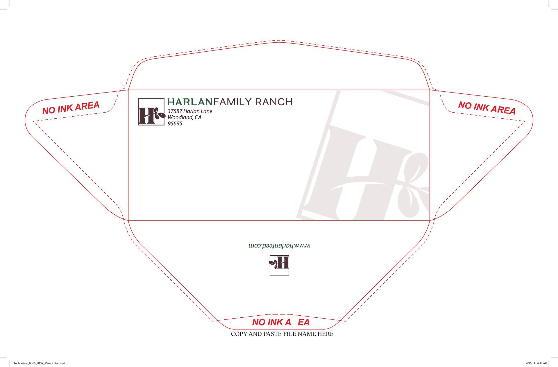
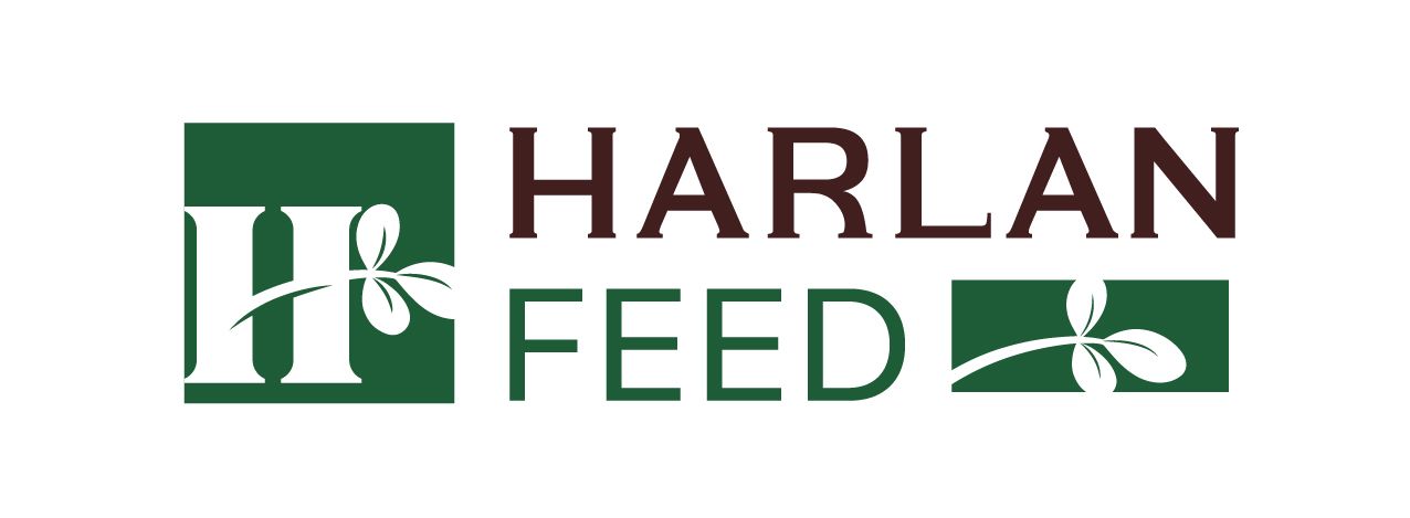
Establishing the Harlan Farms Legacy
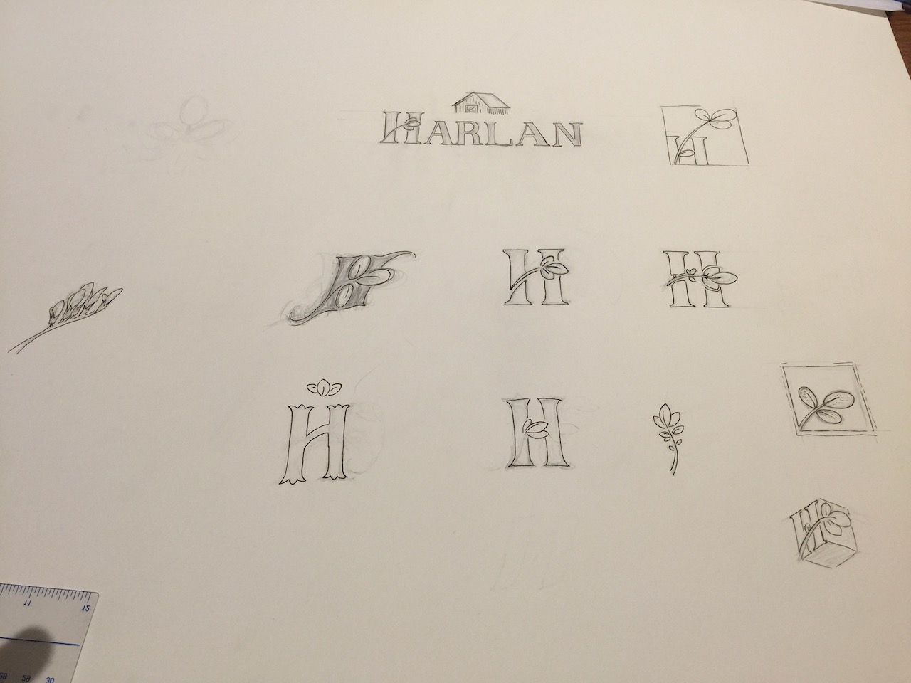
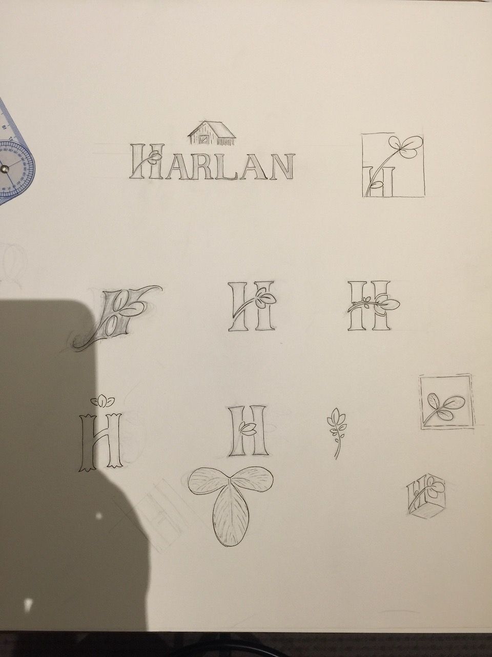
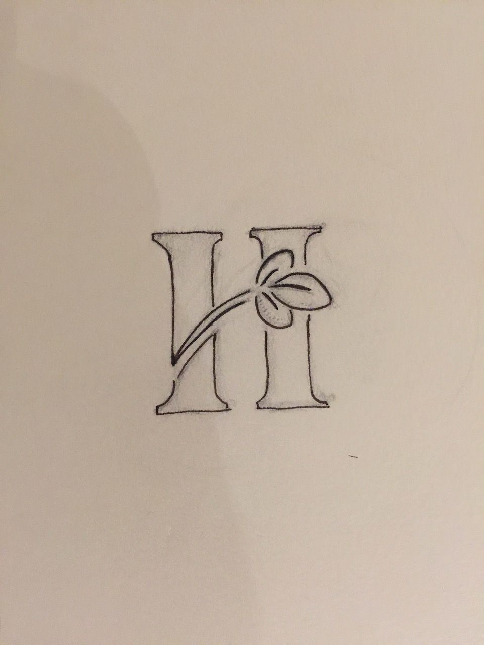
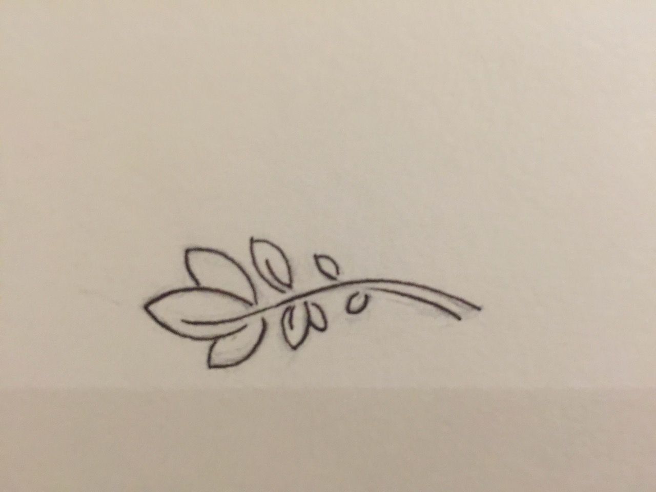
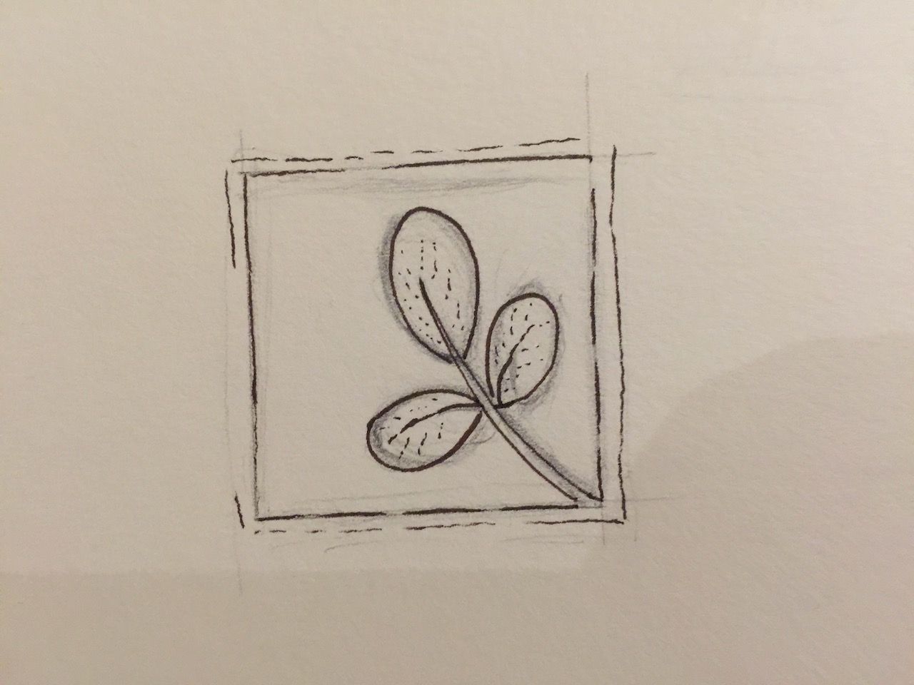
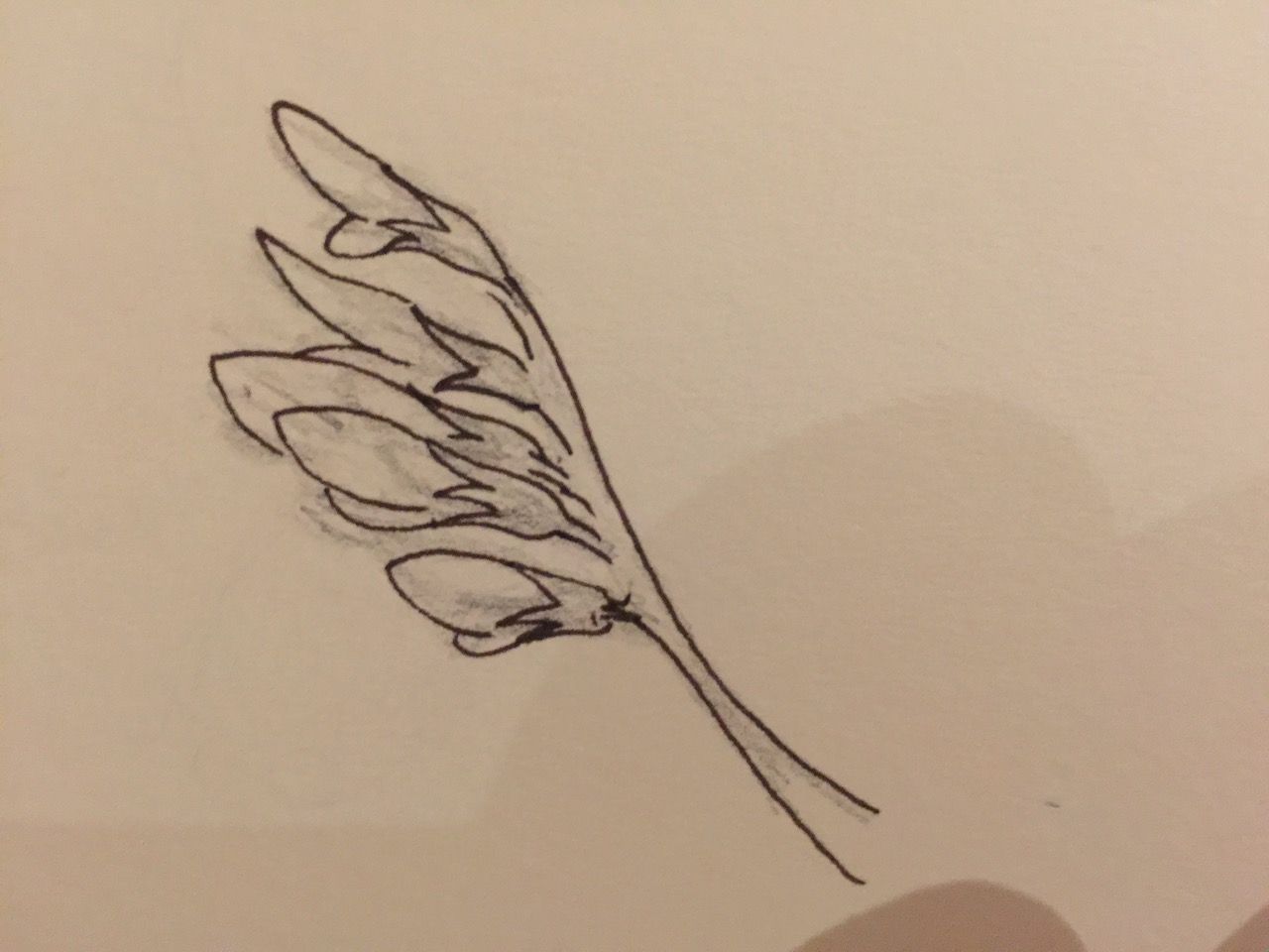
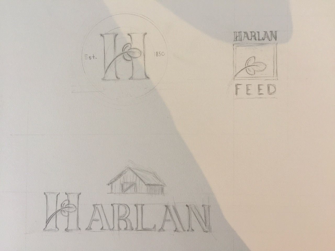
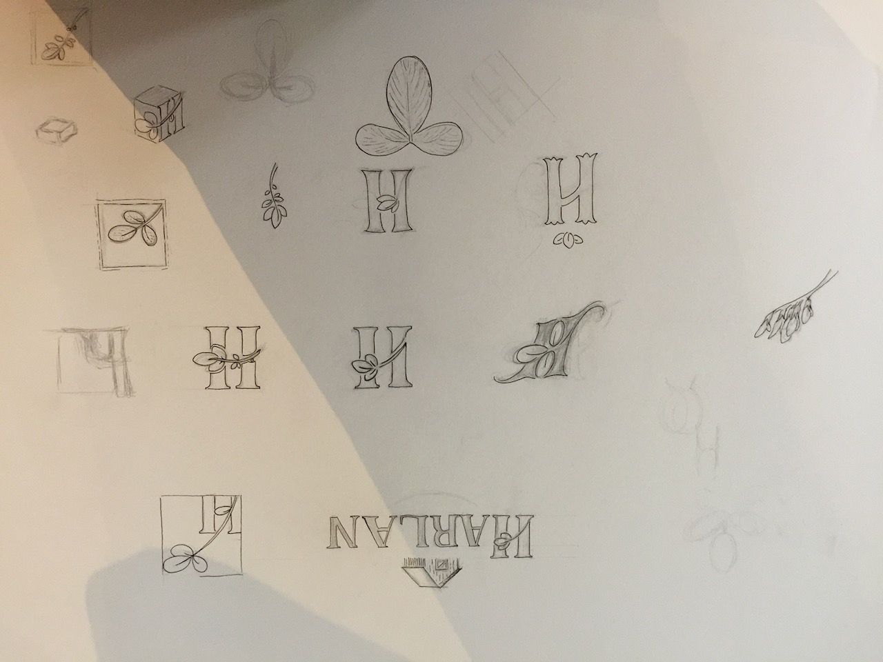
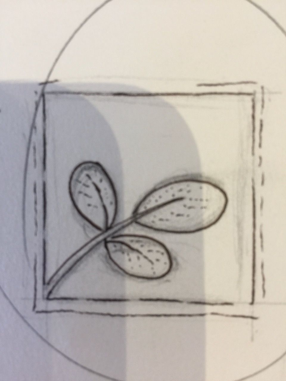
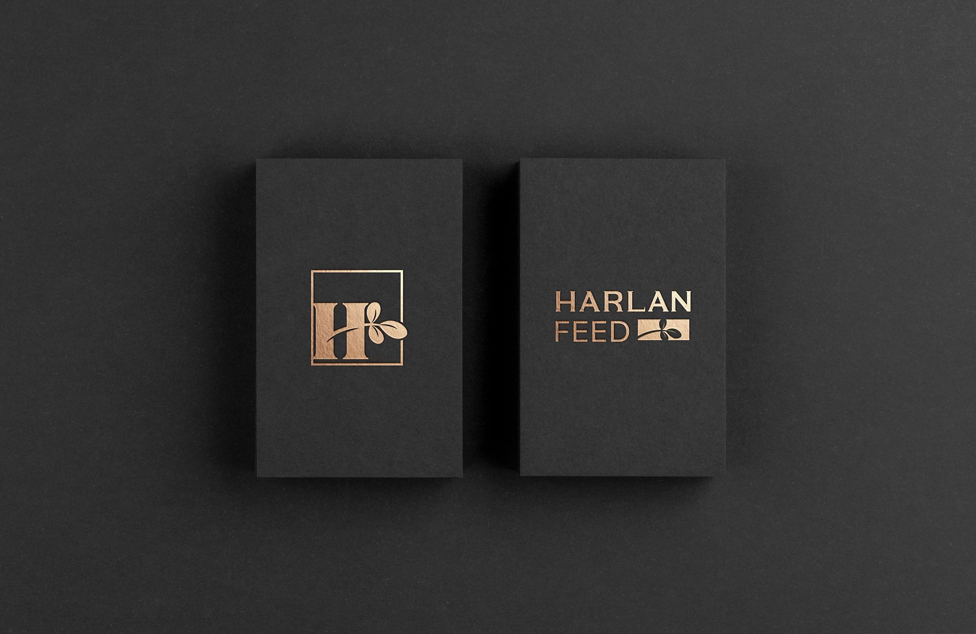
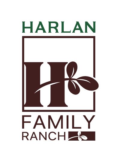
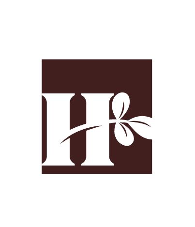
The final phase of our process focused on synthesizing the core historical and familial elements into a timeless mark. We meticulously finalized the details of the alfalfa clover, utilizing it as the key botanical element that ties the brand directly back to the foundational crop and original agricultural expertise of Harlan Farms.
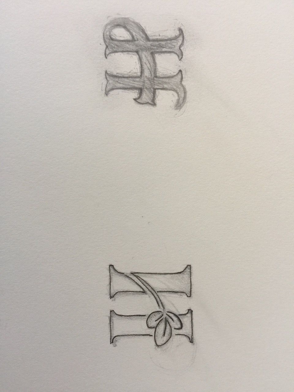
To frame this heritage, we introduced pillars as a robust design component. These pillars are deliberately symbolic, representing concepts like forging, building, and enduring strength—all reflections of the Harlan family's commitment to generational growth and resilience.
The ultimate design features the detailed alfalfa clover seamlessly connecting the two pillars. This powerful union not only gives the logo visual stability and a strong, established feel, but also narrates the story of the business: a legacy (the pillars) built upon the foundational success (the clover).
In establishing this new identity, we have created a logo that is far more than an insignia; it is a permanent mark designed to propel the strong family business forward while simultaneously reaffirming and engraving the Harlan Family name deep within the Woodland community for generations to come. The result is an emblem of history, quality, and lasting commitment.


